Brand + Identity
Every company needs a logo that is memorable, meaningful, and marvelous. We have collected some of our favorites over the years for both your viewing and intellectual pleasure.
Situation
In the wonderful world of advertising, some constants remain, well, constant. Work is always urgent. There will be late nights and plenty of weekends. The client is (sometimes) always right. Life is suffering. Okay, that last one is from Buddhism, but you get the idea. The most important lesson that not enough people talk about (especially in this era of powerful procurement departments) is that one gets what one pays for. Meaning, the quality of work one receives and the experience level of the team assigned to one’s project is directly proportionate to the amount of money invested.
And if you’re investing a lot and receiving very little, you should contact lofgren post haste.
The following examples are projects that we’ve worked on over the years for multi-tiered clients. Some are simple brand refreshes, like what we did for North Texas Cares. While others are complete, from-scratch brand builds, like Fireracker. The commonality among them is that we worked with them to determine what they needed their brand to be despite the initial budget. And then proceeded to, in their eyes, overdeliver with stellar work.
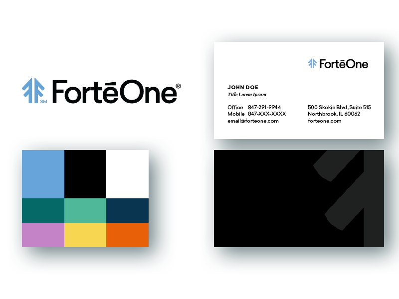
FortéOne
Relevant Projects
Brand Definition, Logo, Color Palette, Typography, Product Brands + Colors, Business Cards, Envelopes, Letterhead, Brochures, Website
Description
FortéOne is a management consulting firm that helps middle market firms maximize their value by implementing concrete, measurable changes. We based their new logo on a foundation of strength, with double Fs forming a mighty pine tree – an historic symbol of wisdom and longevity. One F in the mark represents “Forté” and the other stands for “Fortune.” Together, the Fs form an arrow that represents the growth chart of FortéOne’s clients’ businesses. We chose their color palette to reflect their brand personality of, “Experienced, Trustworthy, Professional, Approachable and Relatable.” See their full case study here.
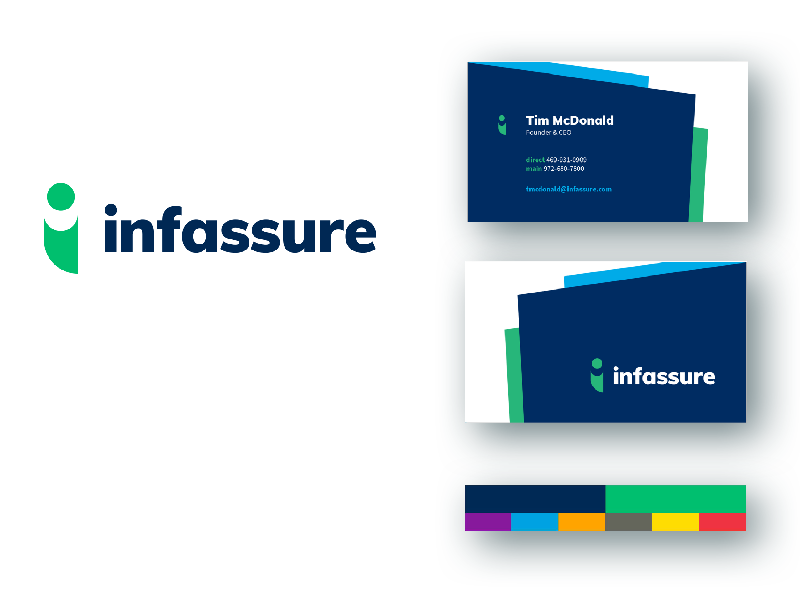
Infassure
Relevant Projects
Brand Definition, Tagline, Logo, Color Palette, Typography, Business Cards, Envelopes, Letterhead, Brochures, Website
Description
Infassure handles all the technical and communications infrastructure of an office building. If you’re moving or upgrading your offices, and if it plugs in (or not), they do it. The “i” in their mark is a human figure that emphasizes that people make the difference in their business. The “i” is also representative of a connector where the ball fits into the cone like two ends of a cable. See their full case study here.
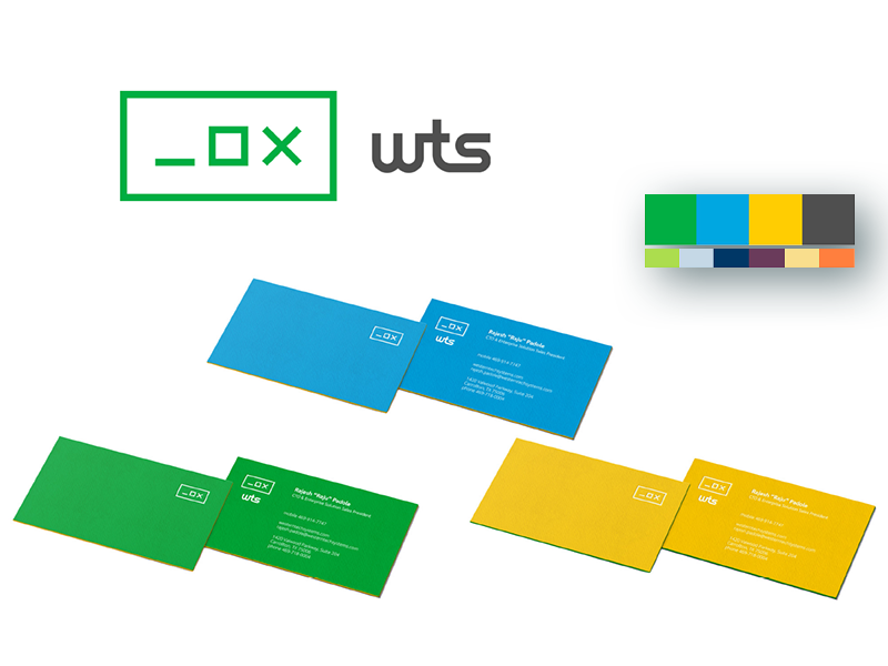
WesternTechSystems
Relevant Projects
Brand Definition, Logo, Color Palette, Typography, Business Cards, Website
Description
WesternTechSystems is a computer and IT hardware services company in Coppell, Texas, that deals with bulk rates for software and hardware, almost exclusively in Windows-based environments. The logo we designed was a nod to the minimize, maximize, and close buttons found at the top of PC windows worldwide. The buttons also represent that there are three distinct facets of their business (hardware supplier, recovery partner, and outsourced IT department). The rectangle around them signifies that all three are included in one brand and one solution. See their full case study here.
Do Luxe
Relevant Projects
Name, Tagline, Brand Definition, Logo, Product Design
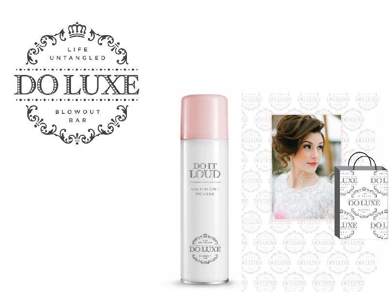
Description
Do Luxe was a proposed high-end blow dry hair salon that caters to women of all ages. It provides a high-quality experience that pampers each customer, allowing them to confidently feel their best. We created branding that is playful and witty, with equal parts class and sass (they are based in Texas, after all). This gave us a chance to flex our product naming and design muscles too. Unfortunately, the founding entrepreneurs decided to pursue a different retail service opportunity after we completed the project.
fireracker
Relevant Projects
Name, Tagline, Brand Definition, Logo, Color Palette, Typography, Business Cards, Letterhead, Envelopes, Signage, Product Design, Website
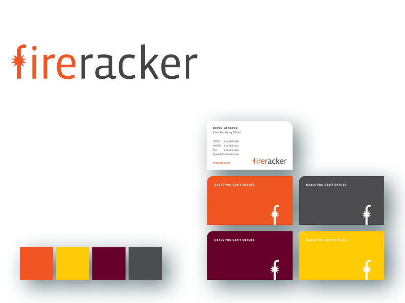
Description
Fireracker was built from the desire of an existing IT company to sell hardware and technology services to businesses online (as opposed to via sales reps as was as is the norm). We created the name and logo — which are a nod to the computer racks that they sell as part of their core business — and their color palette and typography. We defined the brand personality as “credible, friendly, and witty,” so the website and associated collateral matched that same welcoming and fun voice. See their full case study here
The Functionary
Relevant Projects
Name, Tagline, Brand Definition, Logo, Color Palette, Typography, Website
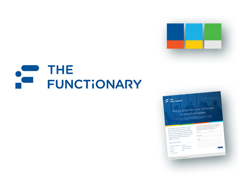
Description
The Functionary provides business process support services to consumers, as well as small business, mid-market, and enterprise customers. They partner with retailers, OEMs and distributors to provide support solutions for e-commerce operations, setup, connectivity, Internet of Things (IoT) devices, cloud services, and customer support. Their name and tagline refer to the “functions” that they provide. The stylized “F” in the logo stands for “Functionary,” obviously, and borrows the dot and rounded lines from the “I” in the logotype. The lowercase “i” in the logotype is representative of a person – for the people that make up the outsourcing of their services.
North Texas Cares
Relevant Projects
Logo, Color Palette, Business Cards, Website
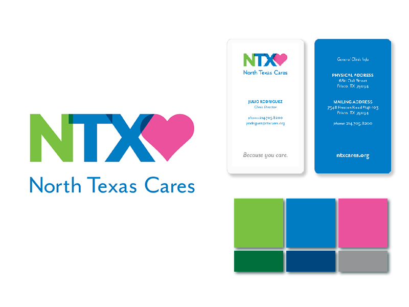
Description
North Texas Cares (formerly Frisco Cares) allows individuals without insurance access to acute and preventive care, immunizations, lab tests, and imaging services at affordable rates. Perhaps most importantly, North Texas Cares provides peace of mind to those in need by being a medical resource when other solutions seem out of reach. We created their new logo, color palette, and business cards after they changed their name. We tied the NTX logo to the preexisting website address – which was ntxcares.org – for better brand recognition.
LocalMed
Relevant Projects
Logo, Color Palette, Website, Mobile Application Design & Development
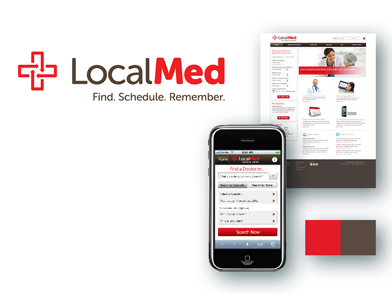
Description
LocalMed is a scheduling platform that allows patients to find doctors in their insurance area network. The site works with the API from the practitioner’s scheduling system, and reminds the patient about their appointment (and follow-up appointments). The tagline, logo, and color palette work together to give a feeling of urgency; the arrows represent data moving from one system to another and then to the patient’s device.
7Sixty
Relevant Projects
Logo, Color Palette, Brand Guide
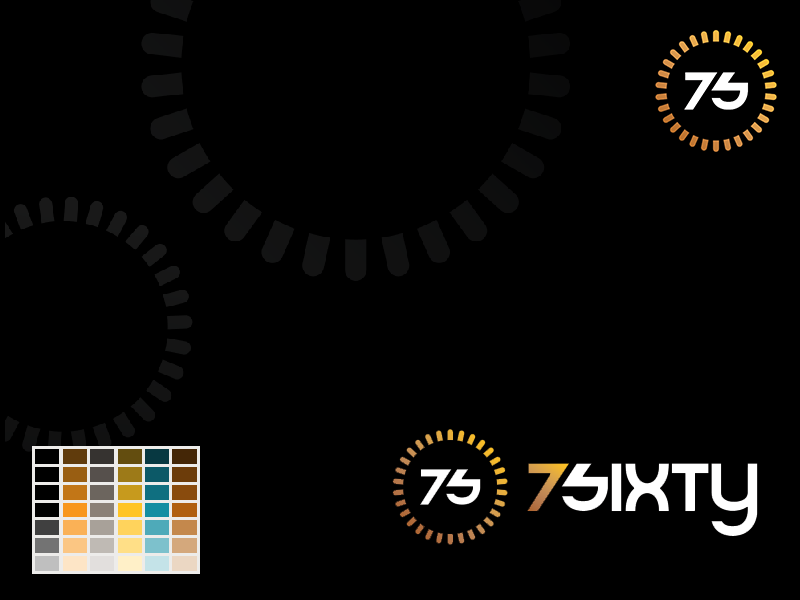
Description
7Sixty, a sub-brand of SouthPeak Games, was a company designed for gamers 7 to 60 years old (thus, the name). Its logo captures the energy and vernacular of gaming with the subtle nod to the loading wheel that surrounds the “7S.” The logotype is a typeface designed specifically for the brand. The logo and logotype are designed to work independently or together as a lockup.
debt.com
Relevant Projects
Logo, Tagline, Color Palette, Brand Guide, Website
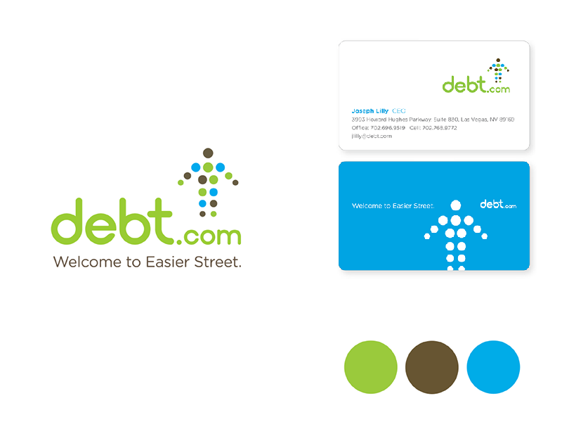
Description
Debt is pretty stressful. Debt.com’s business offering provides real help to real people stuck in this often-debilitating financial situation. The tagline we created, “Welcome to Easier Street” plays on the, wait for it, “easy street” concept that’s been a well-known idiom since 1889, but we’re not trying to say that if you work with debt.com it will be easy. We’re trying to say that if you work with debt.com, it will be easier. The “arrow person” is meant to show the upward trajectory of the consumer after receiving debt.com’s assistance. The color palette uses green and other subdued tones to give a feeling of comfort and hope representing money and financial security.
Star Wellness USA
Relevant Projects
Brand Definition, Logo, Color Palette, Brand Guide, Business Cards, Letterhead and Envelopes, Van Design, Brochures, Website
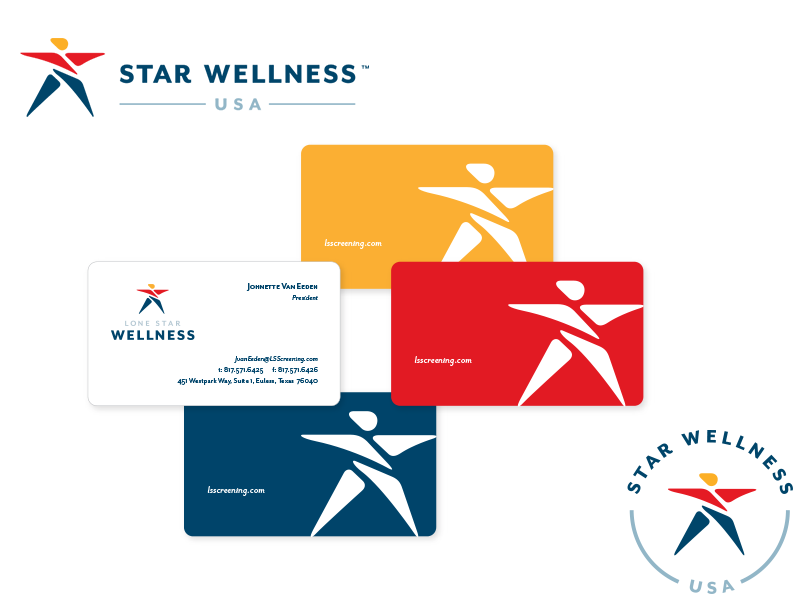
Description
Star Wellness USA, a state-of-the-art corporate health care partner, provides mobile medical screening and on-site laboratory services that enhance companies’ health care plans. The star logo is in the shape of a human with outstretched arms — symbolizing health, joy and wellness — and can be used in white on dark backgrounds and in four-color when it works in context. It was imperative that the logo be visible and recognizable on the vans that service businesses, so we went with bold colors and lines. Most of the companies in their space used more conservative palettes – light turquoise, light blue, light green – so we did what we always do. Which is to not do what others are already doing.
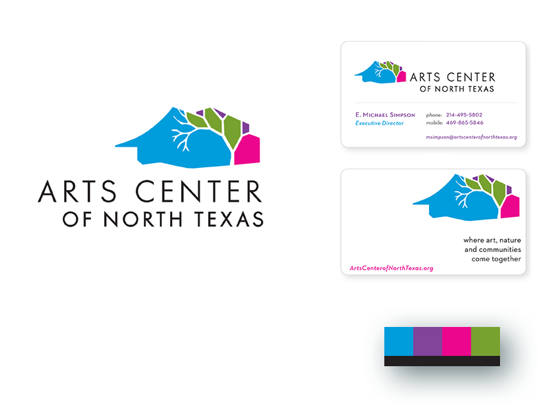
Arts Center of North Texas
Relevant Projects
Brand Definition, Logo, Color Palette, Brand Guide, Business Cards, Letterhead and Envelopes, Van Design, Brochures, Website
Description
The Arts Center of North Texas is a 124-acre collaboration between the cities of Allen, Frisco, McKinney and Plano that integrates the natural environment with performing and visual arts. We designed the logo with a tree to represent the trees and natural beauty found on-site. The pastels evoke seasonal colors found in the undulating landscape. Unfortunately, the center was not developed due to local political B.S. and the four cities continue to be negatively impacted by that. But that’s a story for a different time.
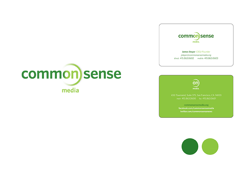
Common Sense Media
Relevant Projects
Logo, Color Palette, Brand Guide, Pocket Folder, PowerPoint Template, Business Cards, Letterhead and Envelopes, User Interface Elements for their website and multiple rating applications
Description
Common Sense is a leading source of entertainment and technology recommendations for families and schools. Their advice, together with their network members, helps parents and teachers make informed decisions about online and offline media choices for kids. The logo that we created features an “On” button to symbolize the “on” rating that indicates a specific piece of media is safe for a specific age group.
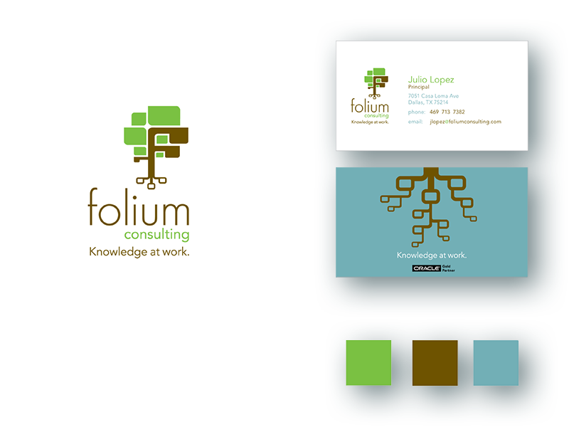
Folium Consulting
Relevant Projects
Logo, Color Palette, Business Cards
Description
Folium Consulting is owned and operated by one superhuman consultant: Julio Lopez. He is a seasoned solution architect who specializes in the Oracle Enterprise Performance Management System, creating stellar databases for his clients. The logo we created represents the tree-like Oracle folder structure, and because trees also represent longevity and wisdom, we think the logo appropriately conveys his deep experience in the industry.
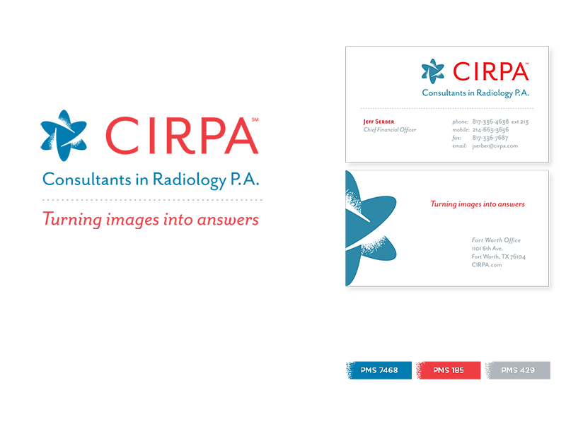
CIRPA
Relevant Projects
Brand Definition, Logo, Tagline, Color Palette, Business Cards, Letterhead, Envelopes, Brochures, Website
Description
For over 40 years, CIRPA’s fellowship-trained radiologists and support staff have worked with facilities throughout Texas to interpret x-rays for doctors. We worked with the CIRPA leadership team to develop their new tagline, “turning images into answers” and their new logo. After discovering that their direct competitors all had blue logos (and at the time, CIRPA did too), we went with a bold red palette to help them stand out in the sea of sameness. And we already know you know that we zig while others zag. Sometimes, we even zug.
boomerang
Relevant Projects
Brand Definition, Name, Tagline, Logo, Color Palette, Business Cards, Website
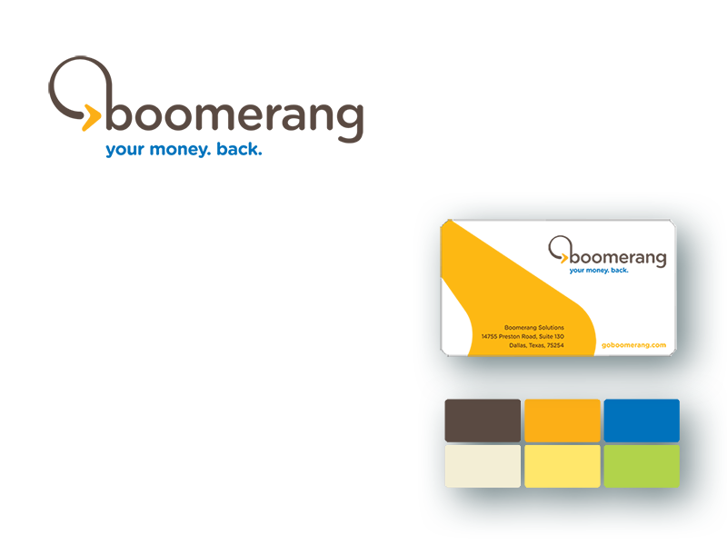
Description
Parent company Settle4Cash (formerly Settlement Capital) wanted to diversify its services by creating a new brand called Boomerang. Marketed to a younger audience, Boomerang acts as a broker between the buyer and the seller to help people receive cash settlements in one lump sum instead of payouts over time. We chose the name Boomerang and tagline “your money. back.” because they’re straightforward, catchy, and youthful, like the audience itself.
Sapere Solutions
Relevant Projects
Brand Definition, Name, Tagline, Logo, Color Palette, Business Cards, Letterhead, Envelopes, Website
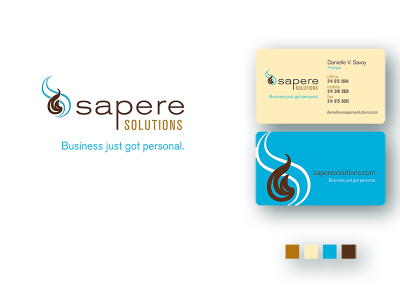
Description
Sapere Solutions is a boutique bookkeeping service dedicated to small businesses and entrepreneurial clients. We designed the logo and tagline to incorporate the personality of the owner and her business. The two intertwined flames represent both the customer (in blue) and the owner (in brown) and how their entrepreneurial relationship is dependent upon each other. It’s no accident, then, that the blue flame is larger and the brown flame smaller — without the support of the latter the former couldn’t succeed. The tagline “Business just got personal” reflects the individual touch that the owner brings to her clients.
Pluris
Relevant Projects
Brand Definition, Name, Tagline, Logo, Color Palette, Business Cards
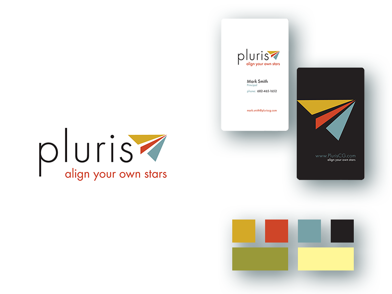
Description
Pluris Consulting works with large organizations to help them identify the most talented people they have on staff and then help create roles that suit those people best. They then make recommendations to their clients to help empower that talent. The logo is a paper airplane that represents the end result of Pluris’s work – turning people who could be anything (blank sheets of paper) into leaders who soar. We believed “Align your own stars” was fitting for the tagline because it also refers to the client supporting their talent from within, creating an internal network of positivity.
Fur the Animals
Relevant Projects
Brand Definition, Name, Tagline, Logo, Color Palette, Business Cards
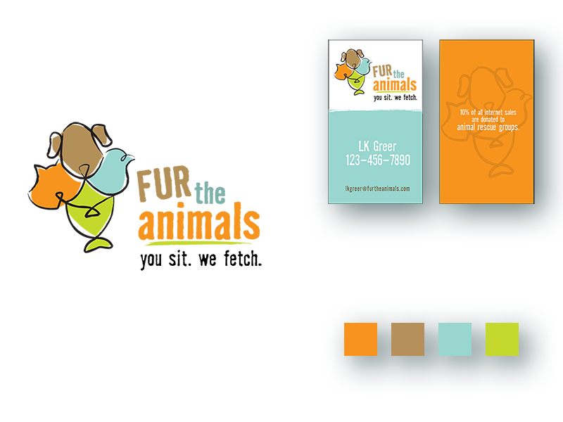
Description
Fur the Animals is an e-commerce website that caters to pet owners with the proceeds from sales going to local animal rescue organizations across America. The first working tagline was, “you just sit on your couch and we’ll go get what you need and bring it to you,” but that was a bit too wordy. Also, we’re joking. But we think you’ll agree that “you sit. we fetch.” Is much catchier. The logo represents a dog, cat, bird, and a fish, and together these pets form a floral arrangement.
Buysight
Relevant Projects
Brand Definition, Logo, Color Palette, Branding Guide, Business Cards, Trade Show Booth, Website
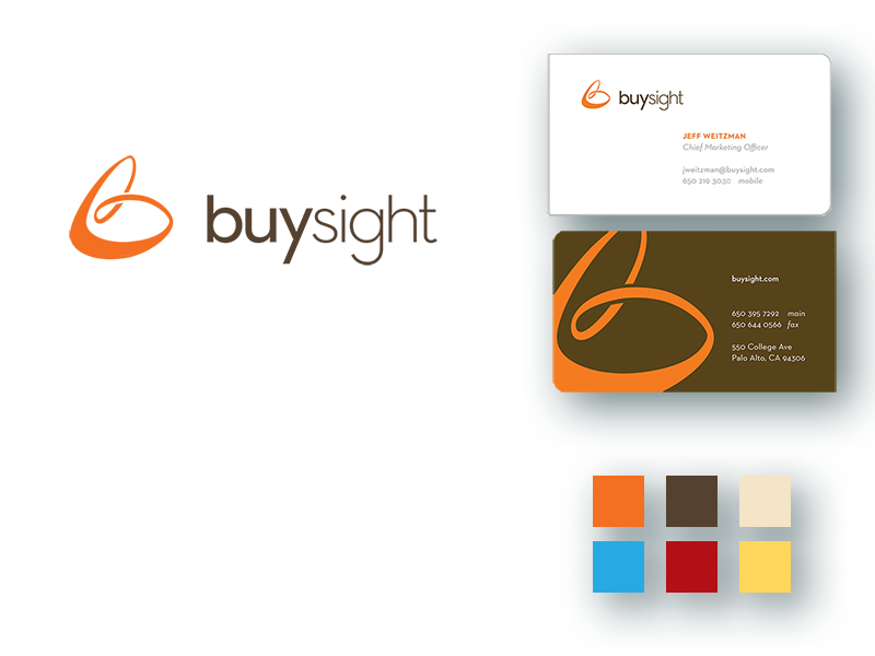
Description
Buysight is a technology company that gathers information about consumers’ buying habits and transforms that information into highly relevant, highly targeted display advertising, connecting unique buyers with sellers of specific products. The stylized “B” in the logo represents the transformation of data into marketing knowledge, highlighting the path data takes from initial creation, through analysis, and back to the consumer with targeted messaging. Assuming said consumer isn’t using an ad blocker.