WesternTechSystems
WesternTechSystems is a small computer and IT hardware services business located in Coppell, Texas. Their lack of any real marketing or branding often left them out of potential clients’ consideration sets. They needed reinvention. So, they turned to lofgren to make a mountain of marketing magic out of their existing molehill.
Situation
Sometimes established brands need to take a hard look at themselves from the outside to reinvent their brand. That decision doesn’t come easily because it involves a lot of soul searching from the client. Clients most likely have questions like, “What do I want my brand to be?” or “How much should I change my brand?” or even, “Is this the right time to change?” When clients have these sorts of questions, we have the experience to provide answers. Enter WesternTechSystems.
WesternTechSystems is a computer and IT hardware services company based in Coppell, Texas. They had an outdated logo and website, which unfortunately formed the totality of their marketing. Our goal from the outset was to create a brand and identity for them since they really didn’t have one. We created a new brand definition, logo, identity, business cards and a new website to make them look like the player they should be, even if they weren’t quite there just yet. In other words, we set out to make them look legitimate in the marketplace.
Brand Definition
The first step in rebranding WesternTechSystems (WTS) was a brand workshop. Conducted with the leadership team and other stakeholders, the workshop allowed us to put into writing — in terms everyone agreed upon and understood — who WesternTechSystems was as a brand. This was challenging because, to be frank, finding a unique angle for a hardware reseller is not easy. We discovered that their main differentiating factor was that WTS effectively helped their clients find money they didn’t realize they had because it was just sitting there inside their depreciating assets. WTS could do this because their business model allowed them to reclaim existing hardware in companies and then provide those companies with a credit toward new hardware purchases, and they could do this uniquely because of hidden advantages they found in other parts of their business. But that message was buried somewhere deep in their positioning – even deeper than this very sentence. So, after a smattering of brainstorm sessions, this brand vision emerged, “WTS enables companies to uncover their hidden potential by providing exceptional IT solutions and services.” Note that this vision was not so specific as to handcuff WTS from expanding into future services. It was about what they do — not how they do it.
Logo, brand & identity
Logo
Next, we tackled the logo. Creating a logo or re-creating a logo involves a lot of conversation between the client and the creative agency. We’ve included the evolution of the logo below, from the original pencil and paper sketches, to the final product. Our process begins with multiple logos at once and then we narrow them down to two, at which point the client chooses a final.
Here is a peek into the final two logo options we provided to the client. This shows you the two finalists as they evolved across the three rounds.
![]()
Final Logo:
![]()
The logo the client selected was designed to be a nod to the minimize, maximize, and close buttons found at the top of PC windows worldwide. We wanted to incorporate them into the logo because the buttons speak to their techy workforce and audience. The three buttons also mirrored the three distinct facets of their business: hardware supplier, recovery partner, and outsourced IT department. The rectangle around them signifies that all three are under one brand.
We also shortened WesternTechSystems in the logo to WTS, which gives a sense of urgency and is visually a quicker read. Let’s be honest, their name — which they weren’t going to change — is a bit of a mouthful, especially when written as one word. Using WTS provides both visual and auditory shorthand for customers, so they don’t get taken out of the moment and make the messaging less effective.
Together the buttons and the truncated name work to spark conversation about the brand and services, and quickly identifies WTS as a trusted tech services partner.
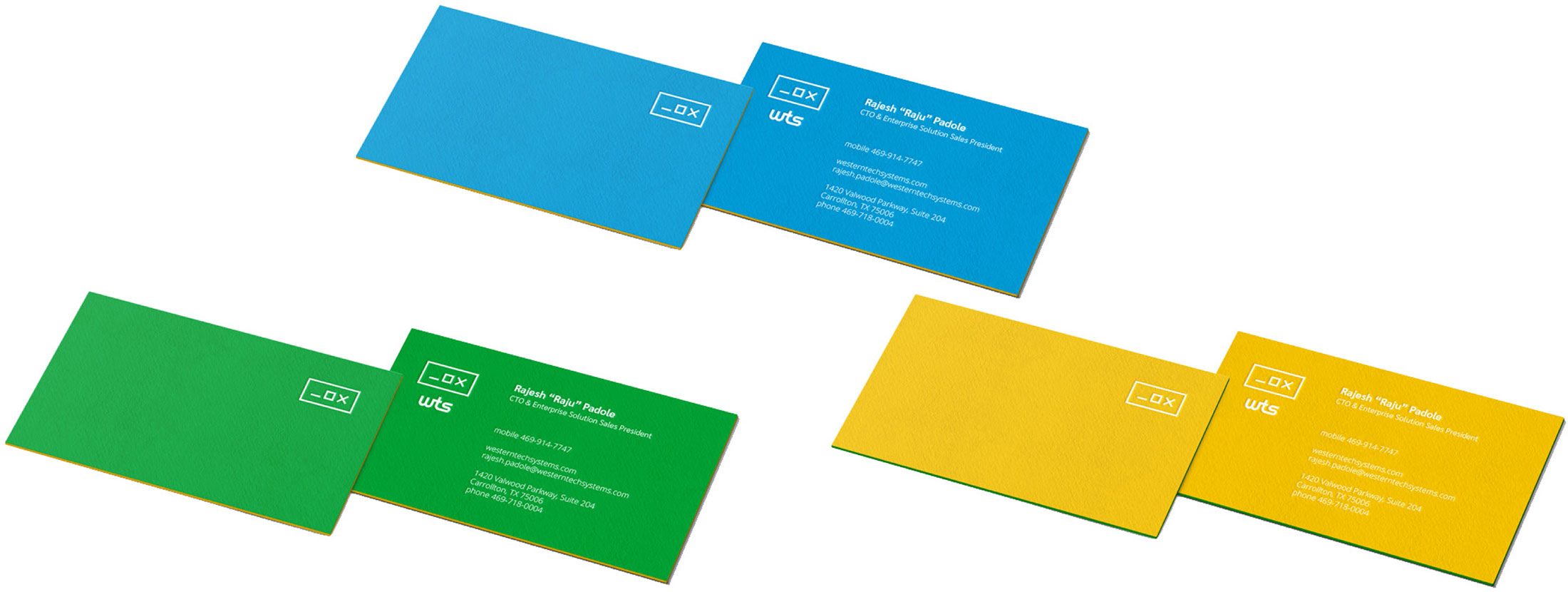
Business Cards
If something is worth making, it’s worth making interesting. The cards we designed for WTS were printed on thick paper to make their brand unique, and we used their primary colors with the new logo on the fronts and backs to further amplify the brand. We believe that each positive touch point a brand has can make it stronger and, over time, increase revenue. And these business cards certainly made the WTS brand stronger by making a strong impression.
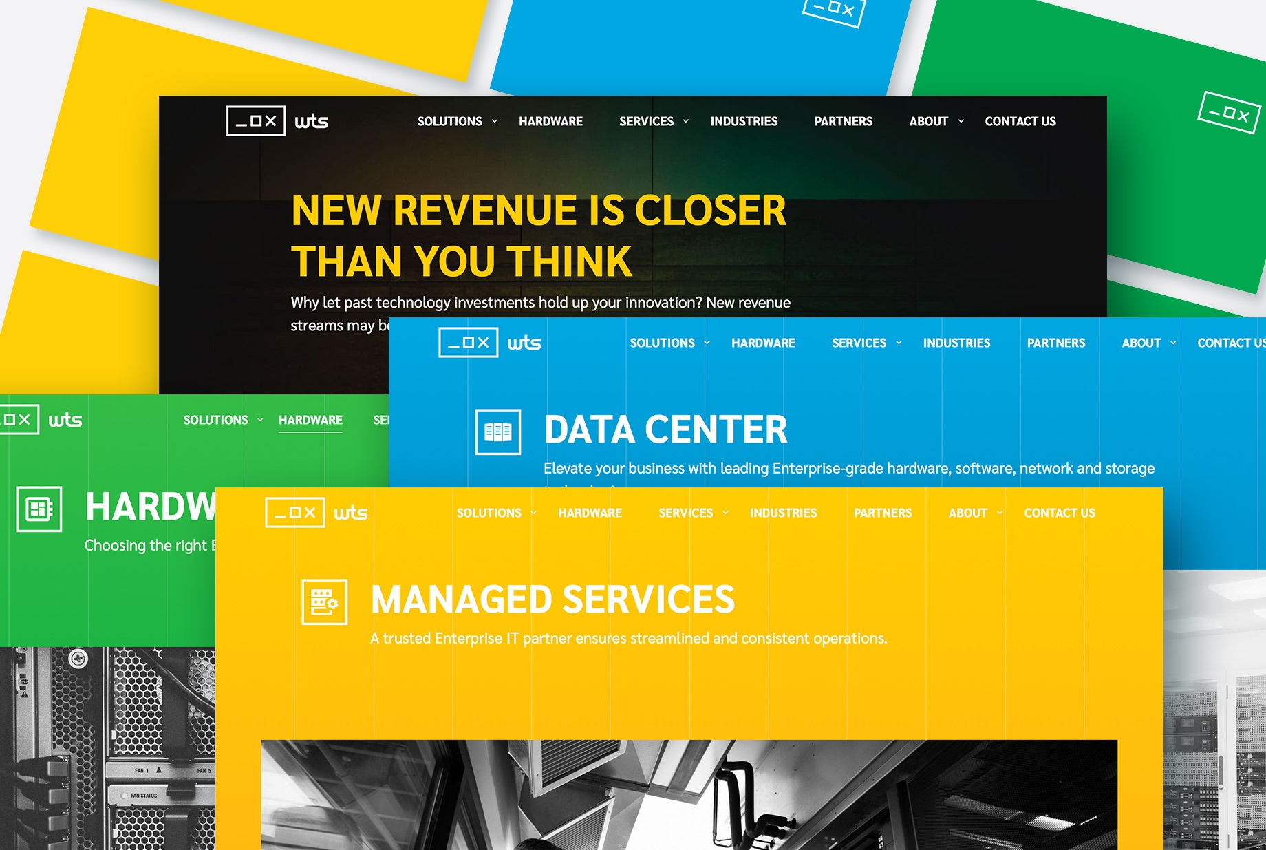
Website
Building or upgrading a website can be costly. Let’s be real. The entire site requires a consistent voice, and each page has to have a thematically coherent design. All of which take time and resources. So, the more time the client can devote to defining each page for their brand, the less time will be spent on creative.
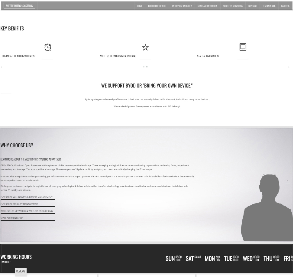
When WTS approached us for help on their website, we worked with the leadership team to define each webpage and transform them from this:
To this:
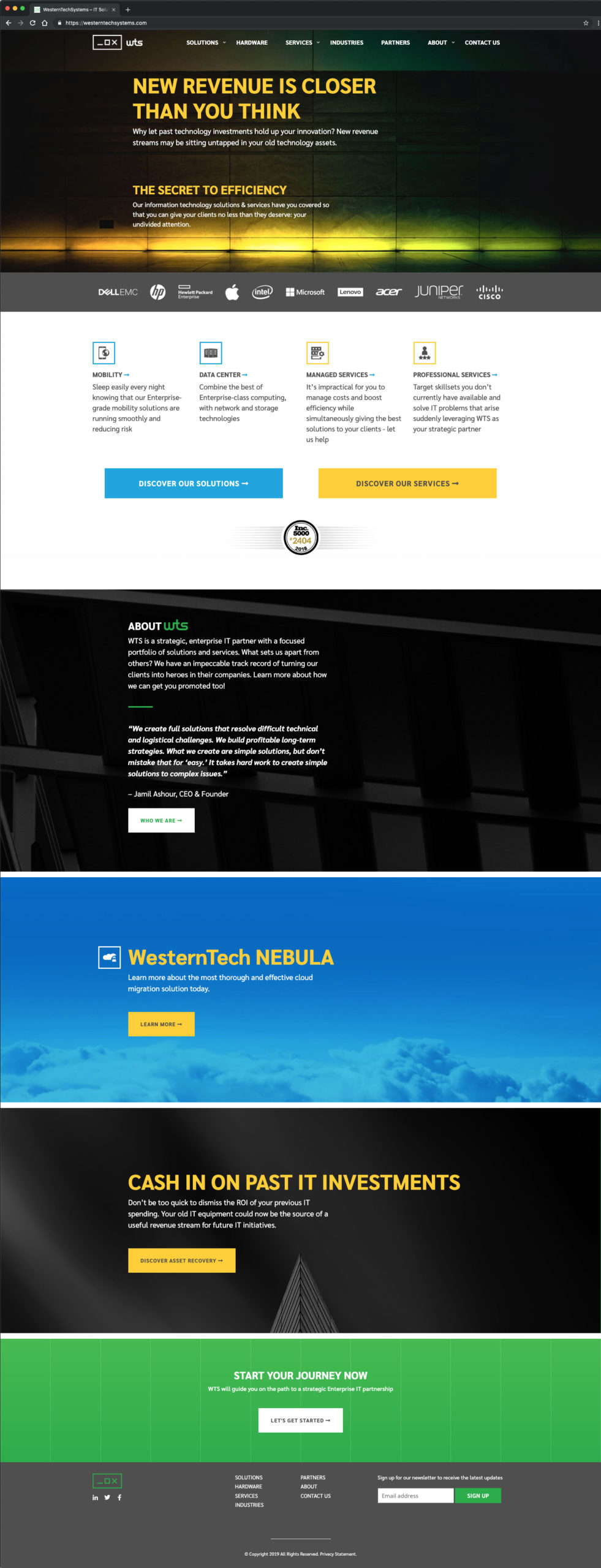
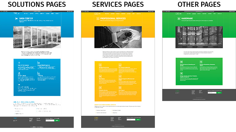
To thematically define categories of pages, we used their color palette to create a scheme for the three categories of their offerings: solutions pages use a blue background, services pages use a yellow background, and all other pages use green.
Icons
Icons. Lots of icons. A true cornucopia of icons. Too many icons? Nay. At least not in this situation because WTS needed to visually identify all of their services and solution offerings with icons. These sophisticated icons give a certain level of legitimacy on their website, their communications collateral, or wherever they’re used.
![]()
Outcome
We redefined WTS by taking a holistic look at their business — breaking everything down from their core messaging and logos to their color palette and website — and presented them anew as true performers in their space. With our assistance, WTS went from “meh” to “mighty nice.”