Infassure
Infassure specializes in the networking infrastructures of office buildings, corporate campuses, and industrial complexes. If it plugs in, they handle it. What they couldn’t quite handle, however, was converting certain leads into clients. A lack of polish on their branding turned out to be the cause. lofgren was the cure.
Situation
Infassure specializes in the networking infrastructures of office buildings, corporate campuses, and industrial complexes. If it plugs in, they handle it. Naturally, they end up being called upon for a range of issues:
- Office relocation
- Office expansions
- Installing or upgrading smart security systems and A/V technology
- Customizing holistic technology solutions (basically, the whole nine yards)
While Infassure is not a construction company, they do have experienced construction people on staff who understand technology and how it fits in from a design/build standpoint. They can work alongside the construction company and design the infrastructure needed for both the company and the space, then run all the cables, connect all the devices, and make it all work.
The founder & CEO originally contacted lofgren to provide some market research — specifically, to interview past customers and also past leads who did not become customers — to determine what made people both choose or not choose Infassure. The greatest insight gained from that project was that clients who engaged with Infassure believed the experience was top-notch, but those who bypassed Infassure did so because the company’s branding failed to instill an adequate sense of confidence and professionalism.
And so, a brand refresh was initiated.
As a company, Infassure had been quite successful for more than 30 years but felt that they needed a brand refresh to bring themselves into the current day. Infassure had an existing logo, a brochure or two, and a website, but did not have a clearly defined brand, consistent messaging or an established identity. lofgren started at ground zero, building the brand definition, then the logo, then the tagline, then the identity, then the marketing assets.
Brand Definition
Ask three people in a company to define their business and brand, and you’ll get three different answers — especially if those three people are the CEO, COO, and CMO. That’s why a true rebranding or brand refreshing has to begin with codifying the definition of the brand. This is done via workshops and interviews with all major stakeholders. Everyone gets a say. Everyone has influence – probably not equal influence – but you get the idea. The comprehensive brand definition lofgren provides involves four aspects: Brand Vision, Brand Position, Brand Personality, and Brand Affiliation. In the end, there is zero ambiguity as to who the brand is and who the brand’s customers are.
Logo, brand & identity
Before lofgren
After lofgren
Logo
The new Infassure mark includes a bit of symbology:
- The “i” for “infassure” (okay, that’s obvious)
- The “i” is a human figure to emphasize Infassure’s expert staff
- The “i” is also a connector (Infassure connects technology for a living) where the ball fits into the cone like two ends of a cable
Color Palette
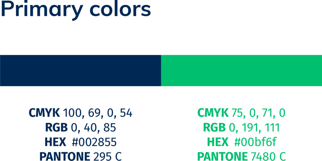
The revised color palette forms the core of the Infassure identity, with dark blue and bright green being used predominantly. The blue is the dominant color with the green being reserved for more strategic moments that require immediate impact.
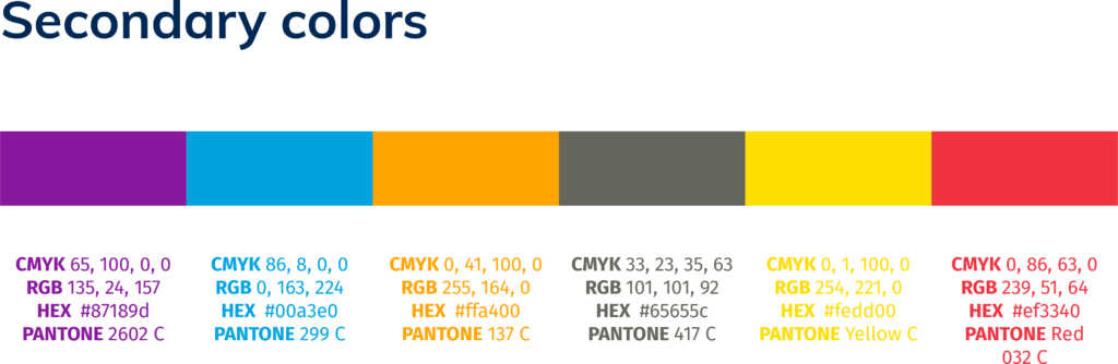
The secondary palette is used for support — adding one or two additional colors from the palette can add visual interest or pair well next to a particular image.
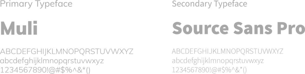
Typography
The use of consistent typography is an effective means of reinforcing a cohesive look in all of Infassure’s materials.
Tagline
Every good tagline encapsulates what a company does (that’s “encapsulate,” not “explain”) in an easy-to-remember way. What does Infassure do? They make complex technological infrastructure design and installation easy. And, since there’s no better metaphor for complex tech going awry than a jumble of cords and cables, the new tagline evokes that, as well. But in a good way. Hence, “Technology untangled.”
![]()
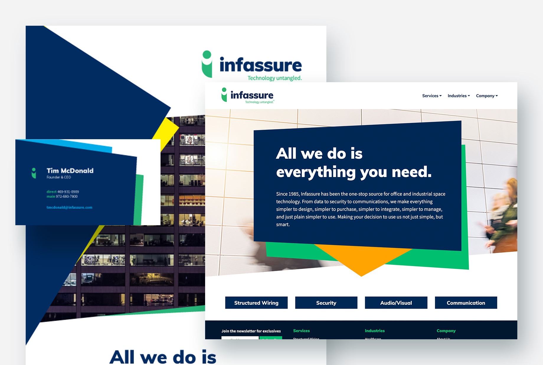
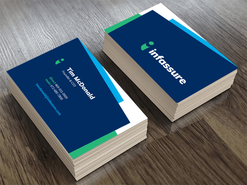
Business Cards
We created business cards that continued their identity. Enough said.
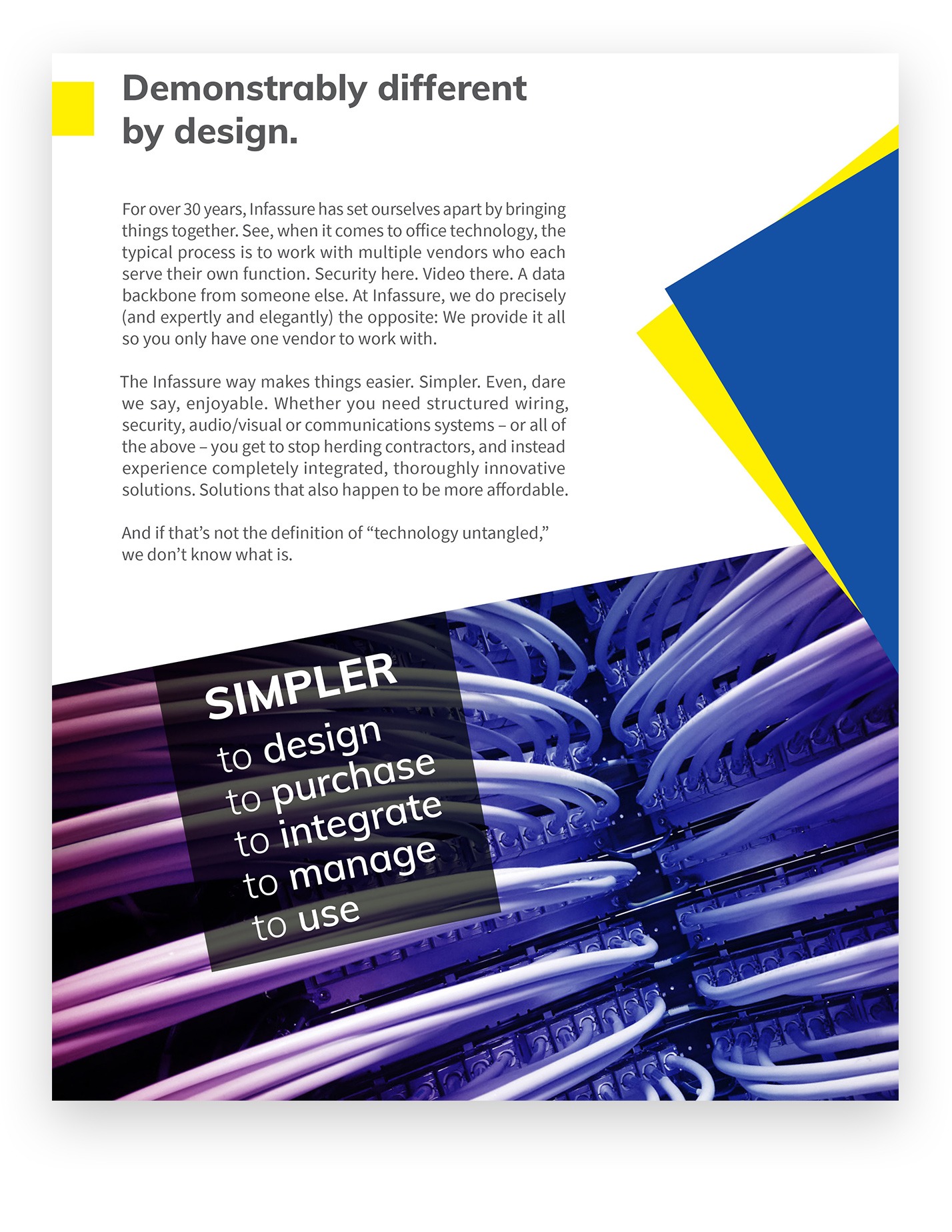
Brochures
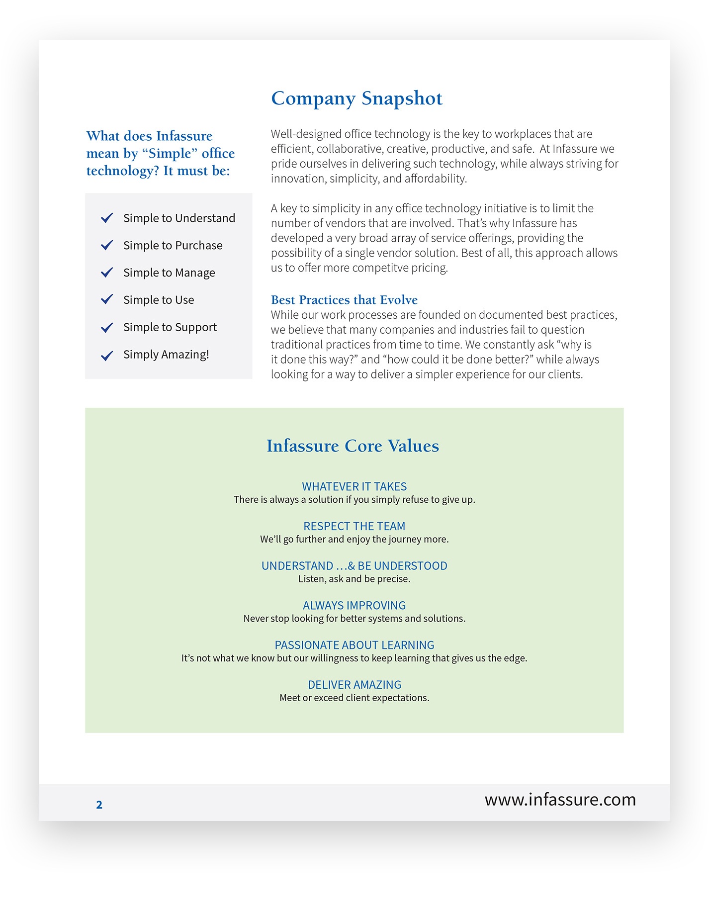
lofgren took Infassure’s sales collateral and transformed it from “meh” to “mighty sweet,” at a budget most people would find shocking. Shockingly low, that is. Aside from the obvious design improvements, we created a new tone of voice for Infassure that carried through all their brochures and on into the website. It’s a voice that is honest, trustworthy, and — here’s the important part — interesting. Also, enjoyable. Because even people who claim to “just want the facts” would still rather receive them with a smile on their face.
Before lofgren
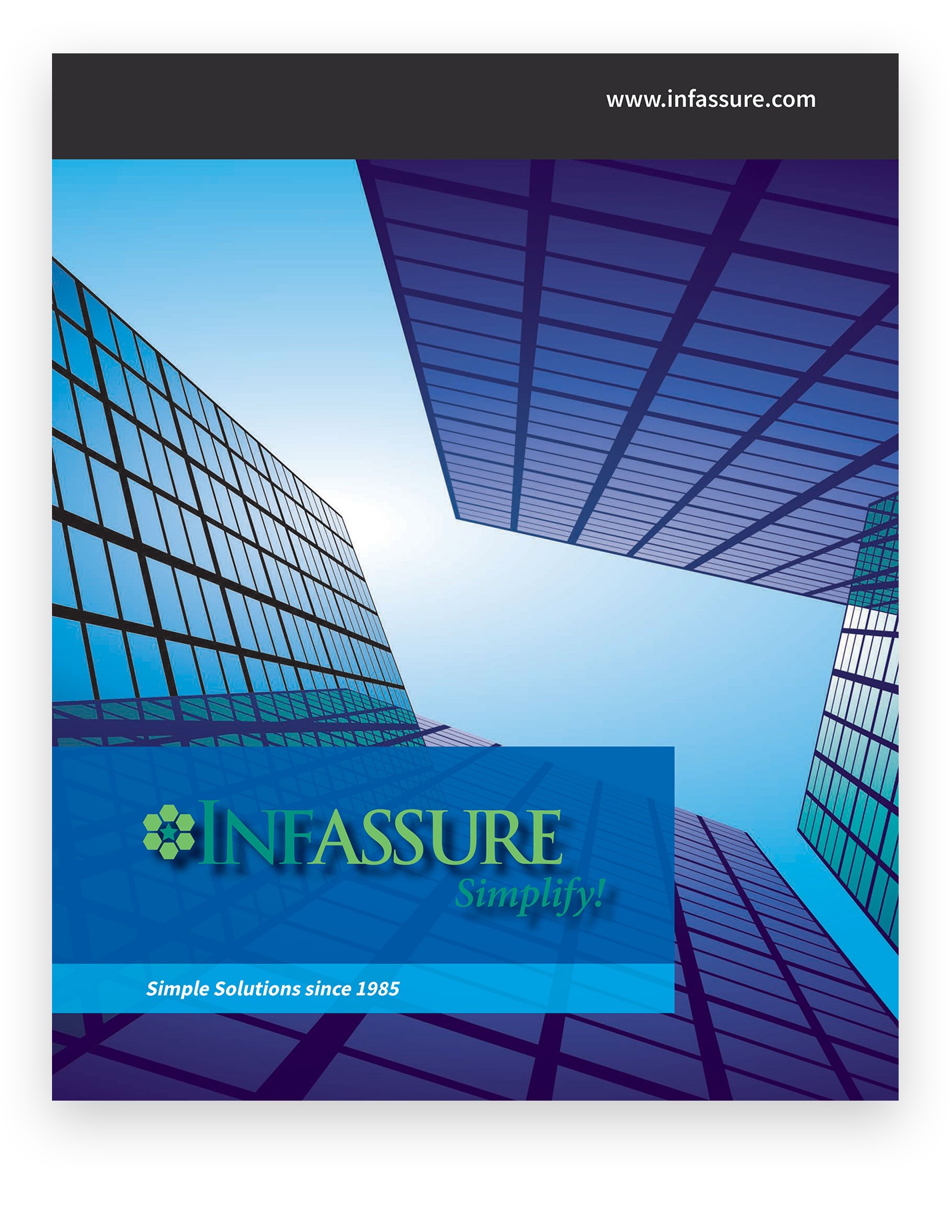
After lofgren
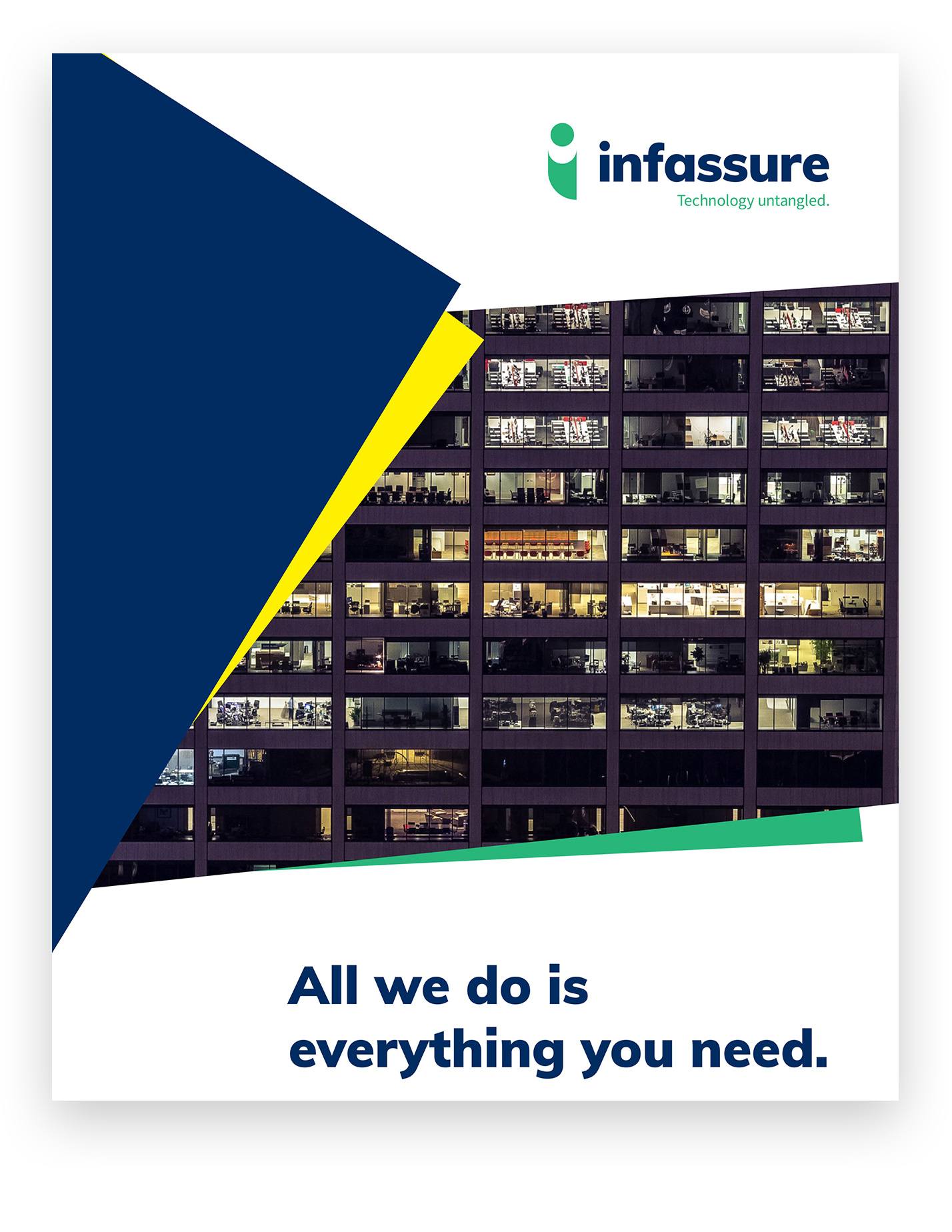
Before lofgren
After lofgren
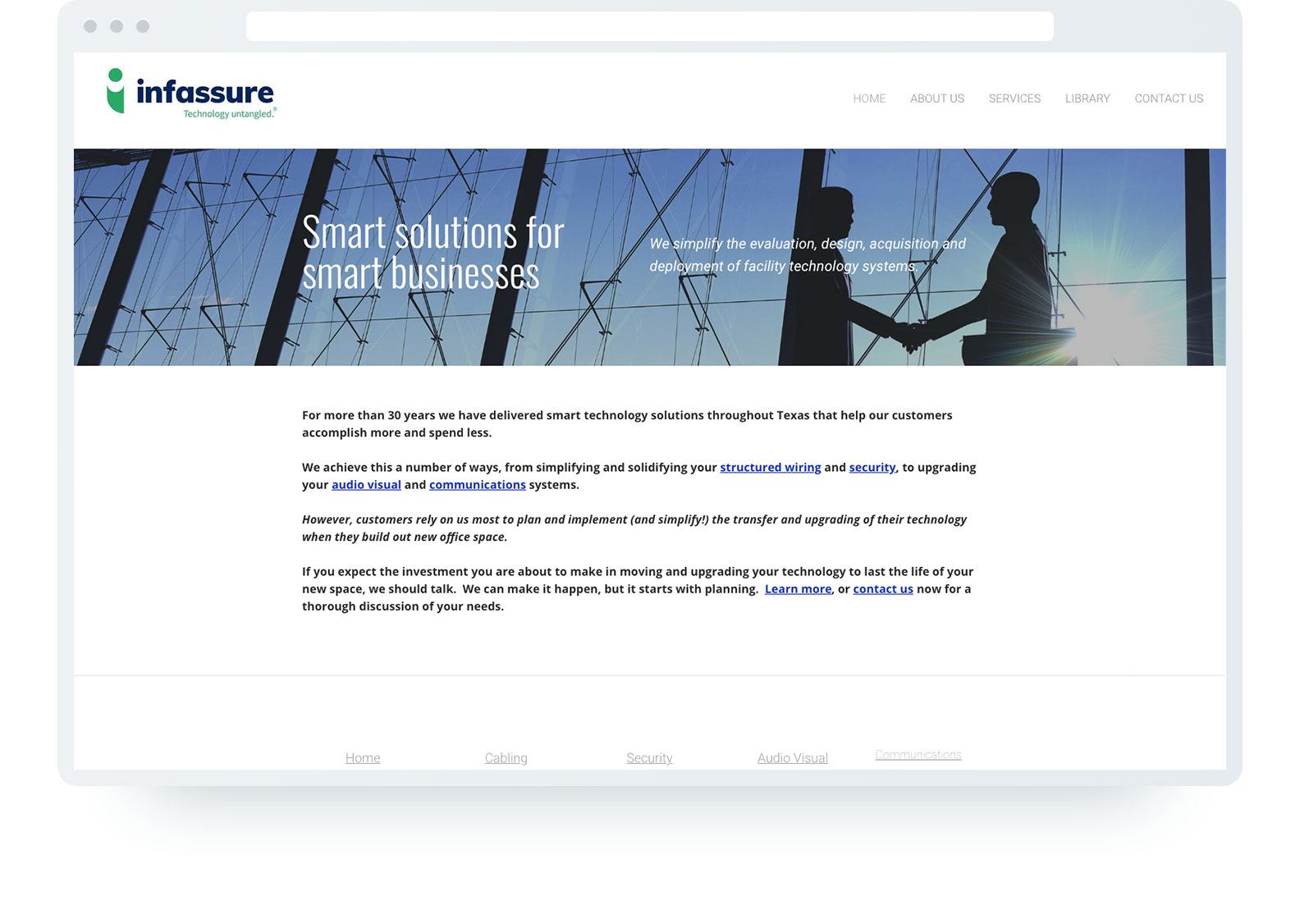
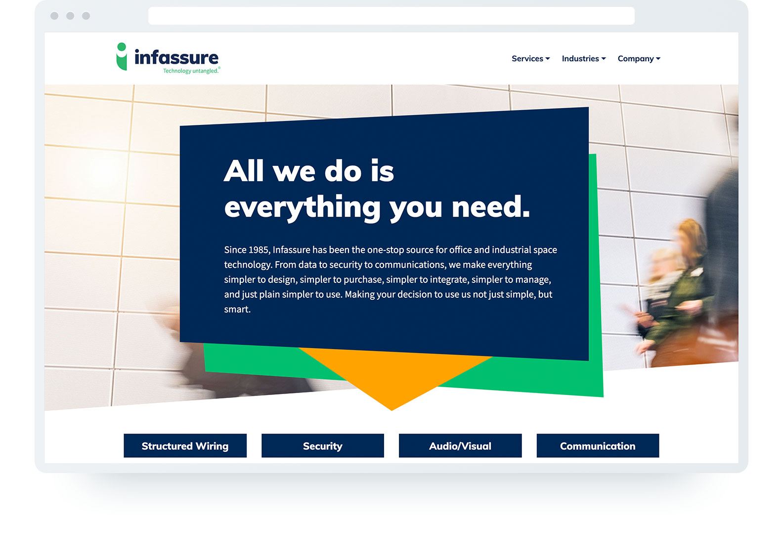
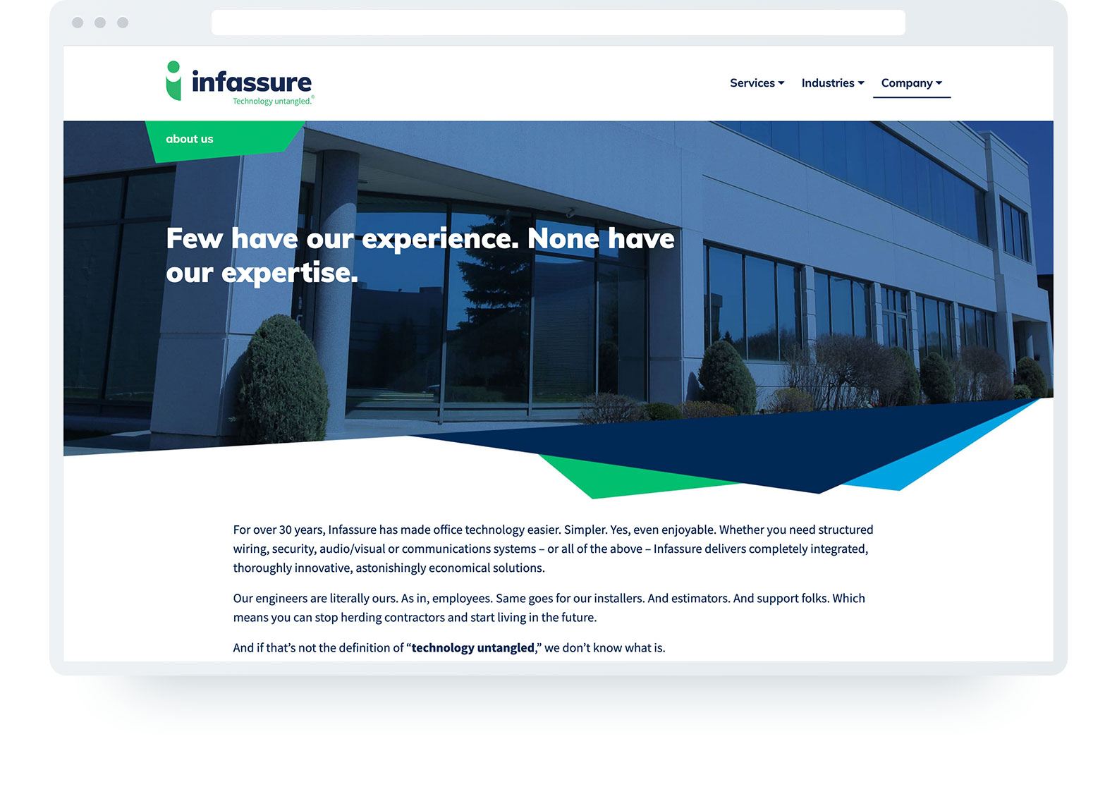
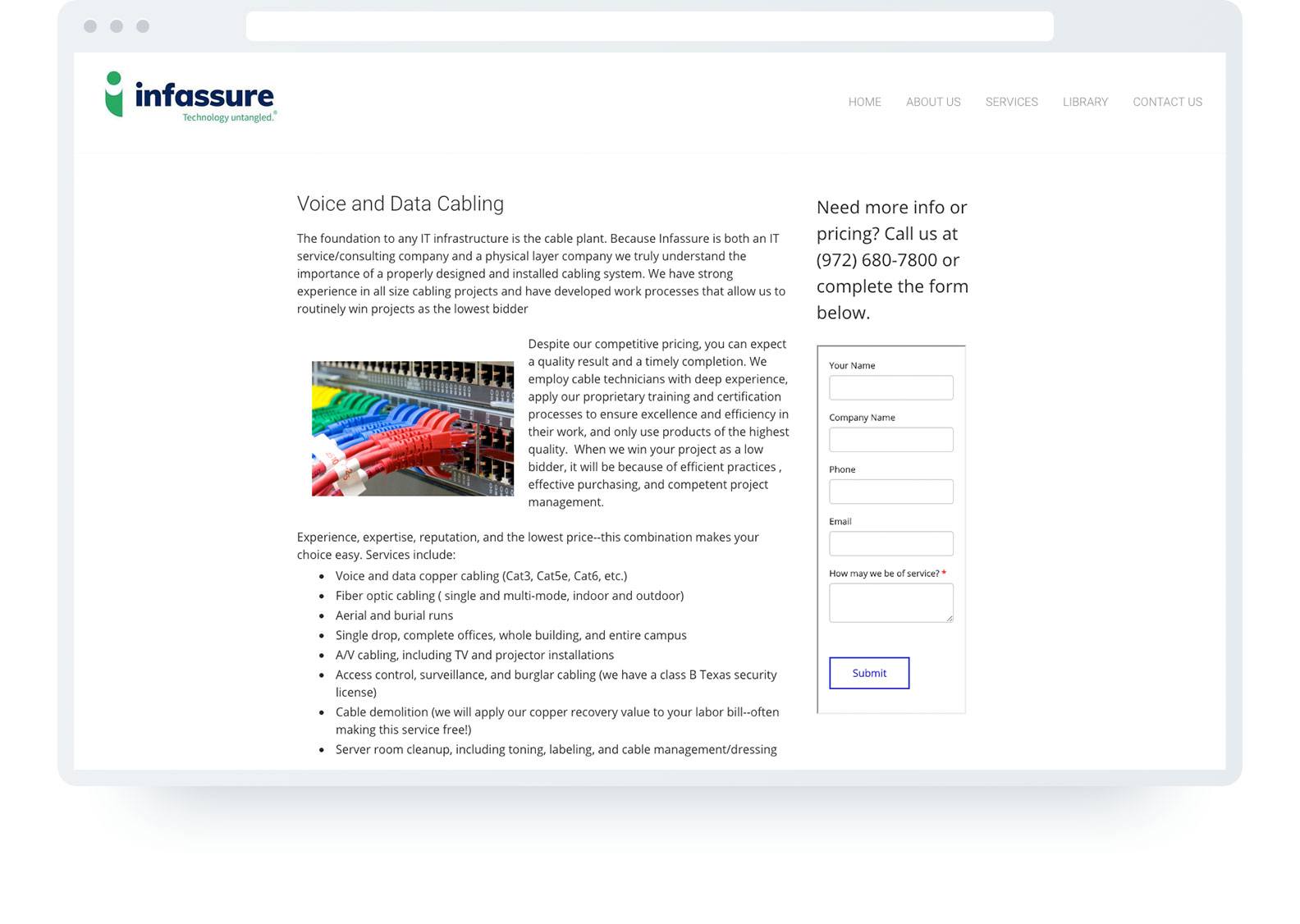
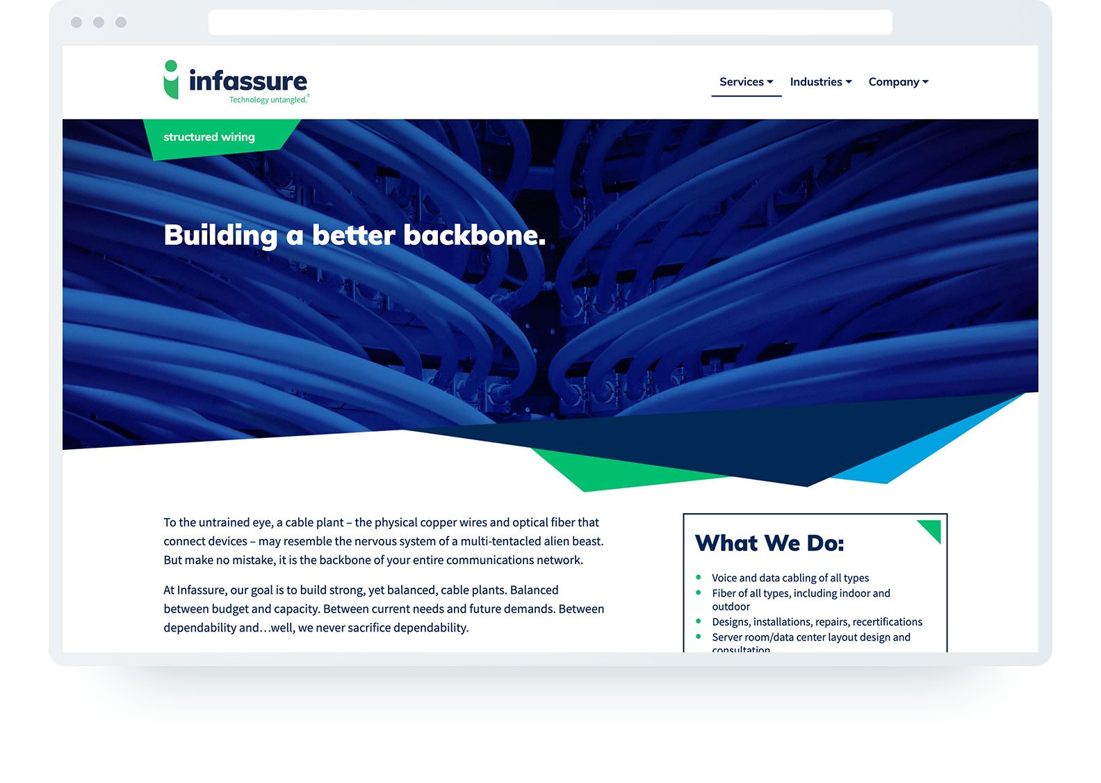
Website
Similarly to the brochures, the Infassure website was redesigned with an emphasis on the new look and feel, combined with better UX and UI. Easy to read with text you’d actually want to read. No fuss. No muss. Just like the client themselves.
Before lofgren
After lofgren
Before lofgren
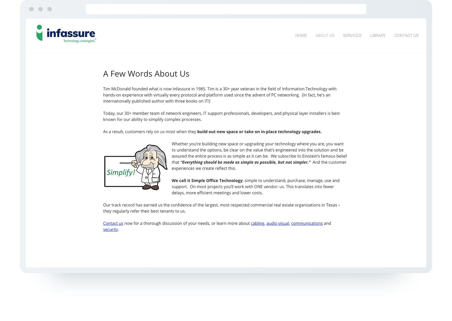
After lofgren
Before lofgren
After lofgren
Outcome
lofgren took a small-looking business and made them look like the industry leader they really are. With branding and identity work created by a group of highly talented, highly experienced professionals who came together for this project and then went their separate ways. Not unlike the Mission: Impossible team. Only more attractive. Now Infassure has exactly what they need to convert the “maybes” into happy, loyal clients.