FortéOne
FortéOne is a management-consulting group focused on helping middle market firms maximize their value by streamlining processes and increasing sales and margins. They originally approached us for a lead generation campaign, but the project quickly morphed into a brand makeover intent on positioning them as the “Bain for the middle market” that they really are.
Situation
FortéOne is a management-consulting group focused on helping middle market firms maximize their value. From strategic advancement to leadership development to supply chain optimization to functional alignment to market-facing initiatives and more, their end goal is to ultimately increase sales and profits for their clients.
FortéOne originally came to us asking for a lead generation campaign, but after examining their current marketing materials and website, we were concerned about our ability to make a real difference. Their existing communications pieces looked second-tier — especially when compared to their larger competitors like Bain, McKensie, BCG, etc.
We explained to the Founder & CEO that we could drive a ton of traffic to their brand, but we weren’t sure it would matter much since their current state of branding could dispel any interest the lead generation campaign had created. Instead, we suggested that going all-in with a soup-to-nuts holistic approach (aka the Fractional CMO model) would be best, and FortéOne agreed. Everything was on the table, save for the name. So we changed everything — logo & brand identity, product names & identities, brochures, business cards & letterhead, and a branding guide. Oh, and a rather complex (from a back end standpoint) website that is the very model of a modern major makeover.
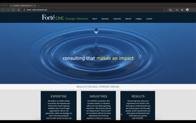
Their website went from this:
To this:
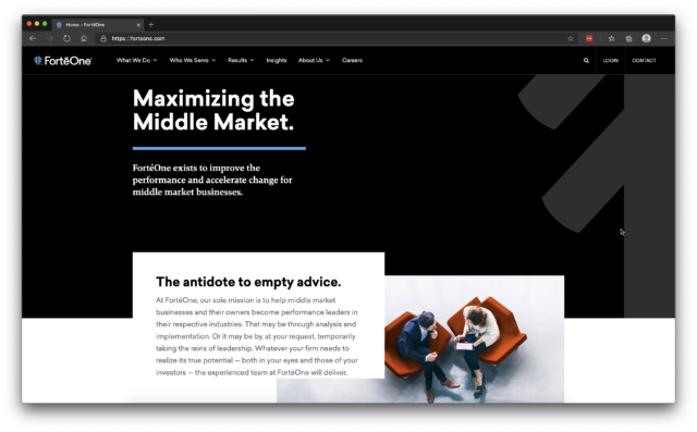
Now FortéOne looks like a bona fide player. Hold them up against Bain and company and they fit exactly where they should.
Brand Definition
Ask three people in a company to define their business and brand and you’ll get three different answers, even — sometimes especially — if those three people are the CEO, COO, and CMO. That’s why a true rebranding or brand refreshing has to begin with codifying the definition of the brand. This is done via workshops and interviews with all major stakeholders. Everyone gets a say. Everyone has influence. Well, probably not equal influence, but you get the idea. The comprehensive brand definition Lofgren provides involves four aspects: Brand Vision, Brand Position, Brand Personality, Brand Affiliation. In the end, there is zero ambiguity as to who the brand is and who the brand’s customers are.
Logo, brand & identity
Logo
![]()
The new logo symbolizes strength and growth. The mirrored F forms a pine tree with upward-lifting arrows. Pines are symbols of wisdom and longevity, and the arrows represent FortèOne’s clients’ growth charts. We assume you know that the mirrored F stands for both “FortéOne” on one side and “fortune” on the other.
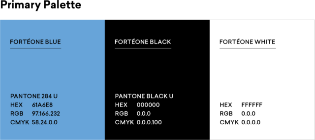
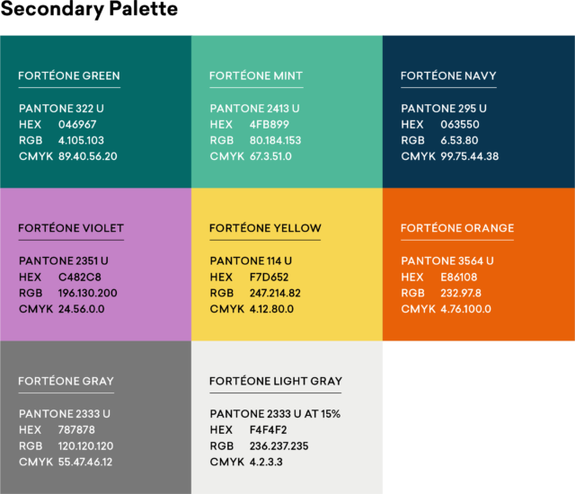
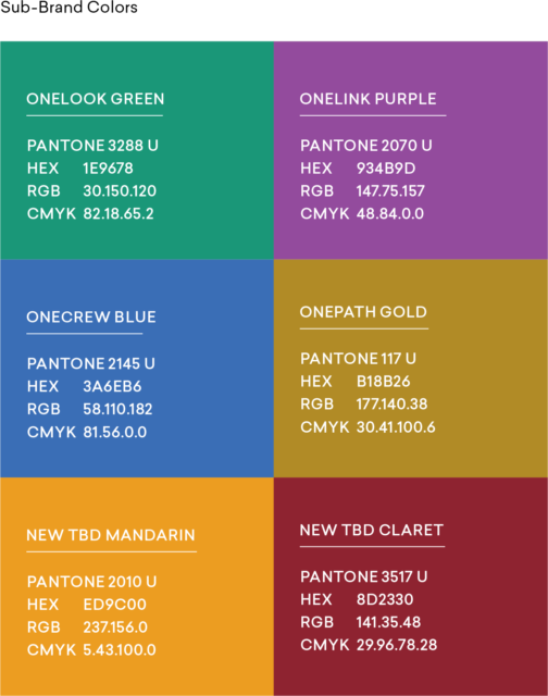
Color Palette
The revised color palette forms the core of the FortéOne identity, with black and white being used predominantly, and the FortéOne blue being reserved for more strategic uses — ensuring it always stands out.
We also prescribed a secondary palette for visual support and to keep things from becoming too monochromatic.
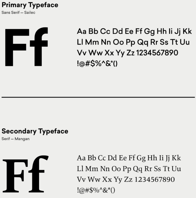
Typography
We chose bold, strong fonts that signify strength. These contemporary versions of traditional typefaces also help keep FortéOne rooted in experience while maintaining forward momentum.
Tagline
We opted to drop their previous tagline of “Change. Delivered.” and instead go with, well, nothing. With the comprehensive graphic and tonal overhaul we were giving the brand, we decided not to add an additional layer for current and potential clients to analyze in the form of a tagline. Instead, we are using “maximizing the middle market” as a leading headline in many pieces, but not associating it in the logo lockup itself — keeping FortéOne the center of attention for the time being. As the brand evolves, FortèOne will certainly revisit this strategic decision.
Branding Guide
We created a brand guide to ensure the client, when left to their own devices, maintains a consistent brand point of view and, of course, look. It includes core visual elements and example applications of these tools in use.
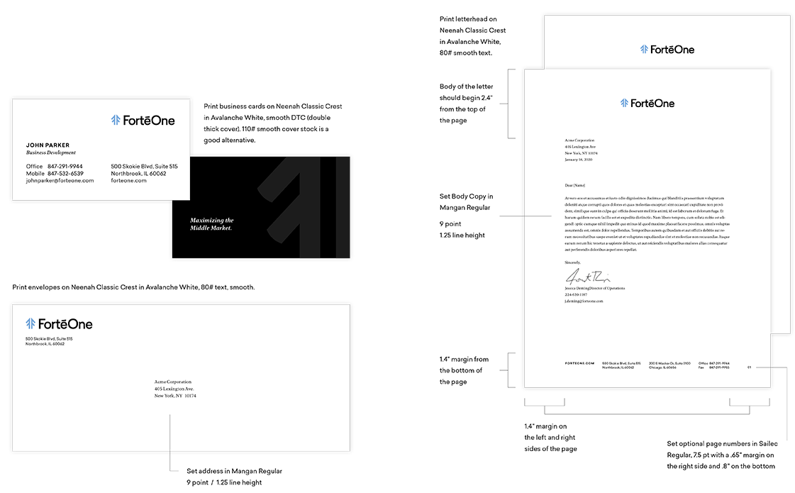
Paper System
Even in this day and age of Slack, email, and DMs, old-school stationery is still needed, especially in this industry. And it’s really hard to win a free lunch from TGI Fridays if you don’t have a business card to drop in the fishbowl.
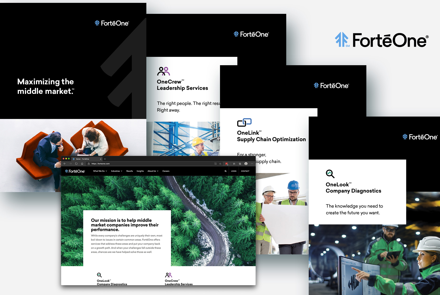
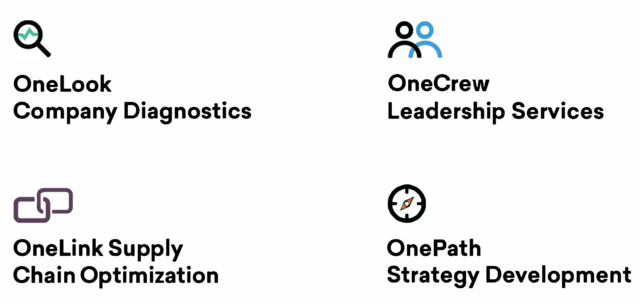
Product offering names, naming convention and new identities for each product
We revamped FortéOne’s core offerings, collecting them into a naming scheme that helps with overall branding, familial synergies, and memorableness. In this case, we took the “One” from FortéOne and added an appropriate descriptor for each service offering, along with a custom icon. We created two additional colors for the sub-brand palette for future product expansion.
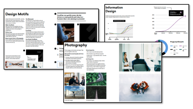
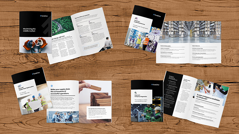
Brochures & Website
The brochures and website are where the new branding really coalesces. The new look is married with a new tone of voice to create a truly unique and memorable brand within FortéOne’s competition set. Strong, bold, smart, and engaging, every brochure and web page remains a part of the FortéOne communications family, while consistently communicating messages that are specific to their objectives. These are not generic-sounding pieces full of generic-sounding jargon. The look and voice are the FortéOne brand and, over time, will become inseparable from it. Which is as it should be. Now, FortéOne can authoritatively project itself as an industry thought leader, going toe-to-toe (and brain-to-brain) with the behemoths of the sector.
Brochures
Here is a high-level view of the brochures we created for them:
Website
The trend these days — since at least 2014 — is to use a huge image at the top of a website’s main page with a slider underneath to navigate through images and brief text. When everyone is doing it, it becomes mundane and uninspired and it’s clear everyone is zigging. We chose to zag.
The website we designed has a fresh and modern look using subtle animations throughout the content, using sliders in smaller content areas where they were actually useful.

So many thought leadership websites overwhelm their visitors with case studies, white papers, blog posts, etc. that pertain to a wide range of topics. Those sites, though well-intentioned, provide the reader with general marketing information when their clients often need specifics.
Our goal was different for FortéOne. We created an Insights section (which included both thought leadership pieces and case studies) that is sortable by specific situations, solutions that FortéOne used, and the relevant industry. The website is aimed toward business owners/operators and venture capitalists who don’t want to take a lot of time wading through all the content. So we created filters that allow the user to hone down to only what is most relevant to them.
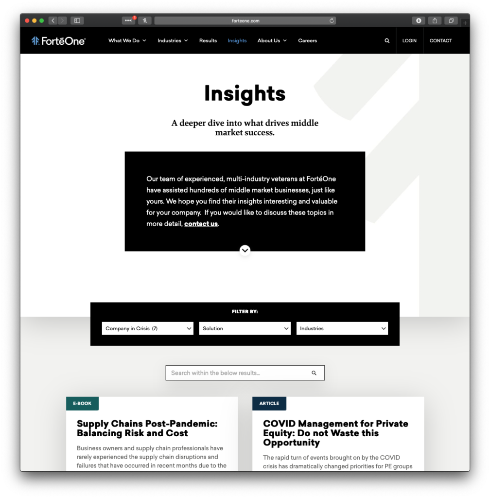
The site is also designed, of course, to be scalable for future content (i.e., growth without our assistance).
Outcome
We transformed a small-looking business into an industry leader worth noticing. All through branding and identity work created by a group of highly talented, highly experienced professionals: a senior creative director, a senior art director, a senior web developer, a senior copywriter and a production artist. An Avengers-like team assembled for this specific project (and who then returned to their respective Batcaves — sorry for mixing Marvel and DC — afterwards). FortéOne has a foundation upon which they can grow over time. And now we can bring the eyeballs to their brand and convert them into opportunities.