Orrion Farms
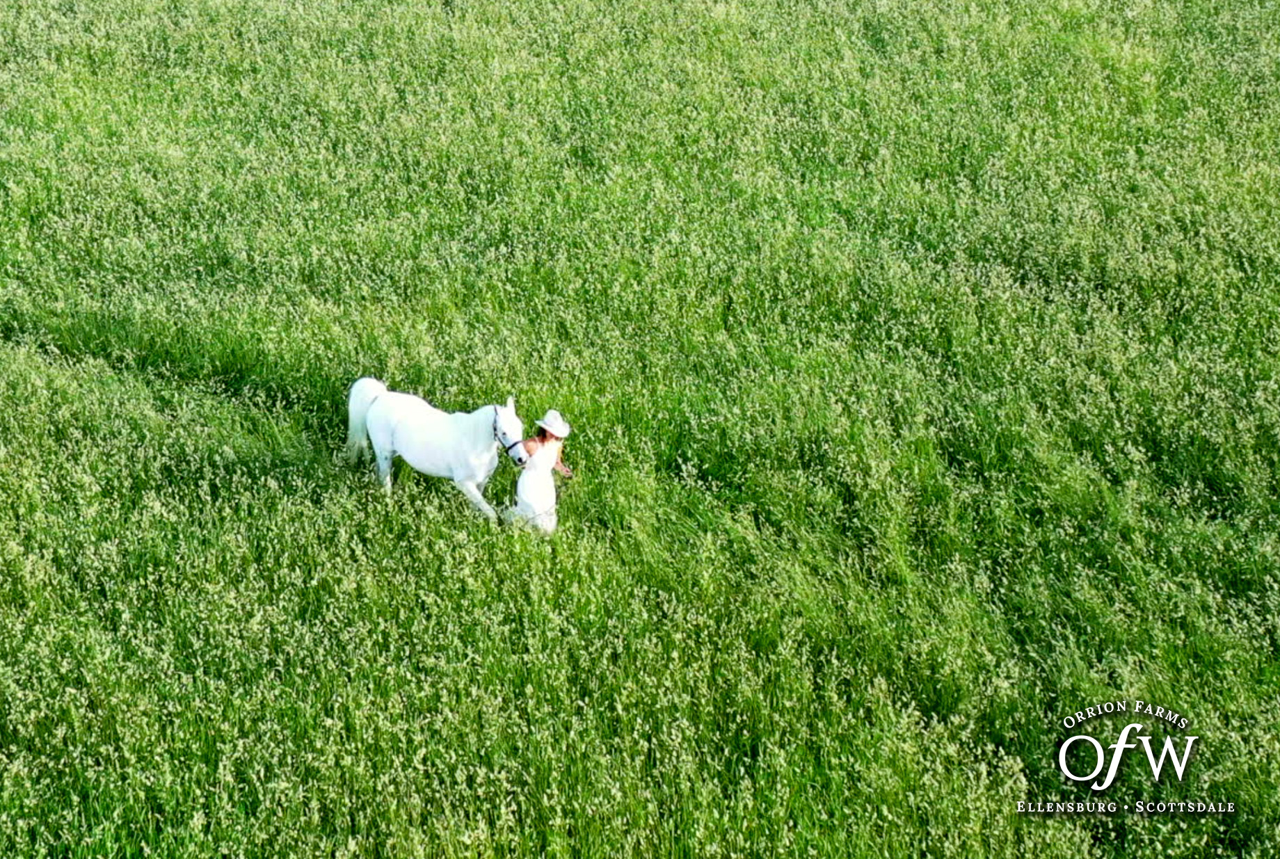
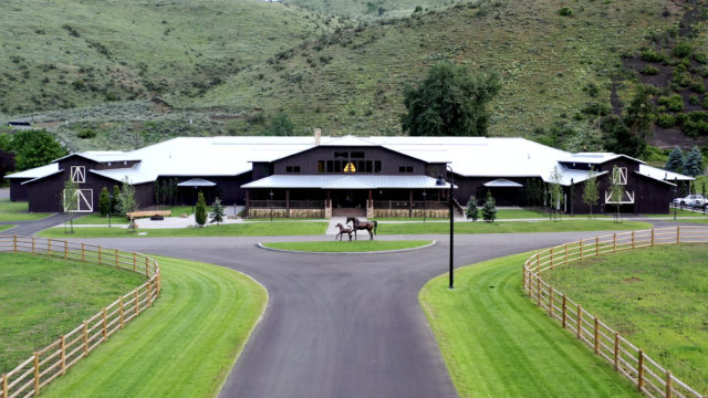
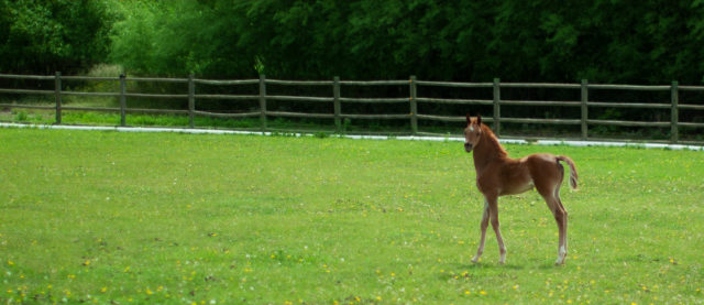
Orrion Farms is an Arabian horse farm nestled in the hills of Washington state. A longtime leader in its niche community, new ownership wanted to take their new investment to the proverbial next level. They needed a brand experience that matched their in-person experience. For that, they turned to lofgren.
Situation
Orrion Farms is an Arabian horse farm nestled somewhere in the hills of Washington state (Kevin’s from Texas, so he doesn’t ask for directions). For years, the farm maintained a strong brand within the industry. But after a transfer of ownership, the new proprietors wanted to elevate the farm’s status to that of a global leader in the Arabian horse world. At the time they contacted us, their website existed on a proprietary platform an “independent web guy” had syndicated to dozens of other Arabian horse farms. So Orrion Farms looked like just about everyone else in the industry. And not in an “everyone is wearing an Armani” kind of way. And their marketing was reined in (see what we did there?) by the platform they were using.
So.
The new owners brought Kevin in as their fractional CMO to correct anything and everything that was impeding their recently acquired brand, and to put Orrion Farms on the path to becoming the preeminent resource for Arabian horses around the world. On a limited budget, of course. No pressure.
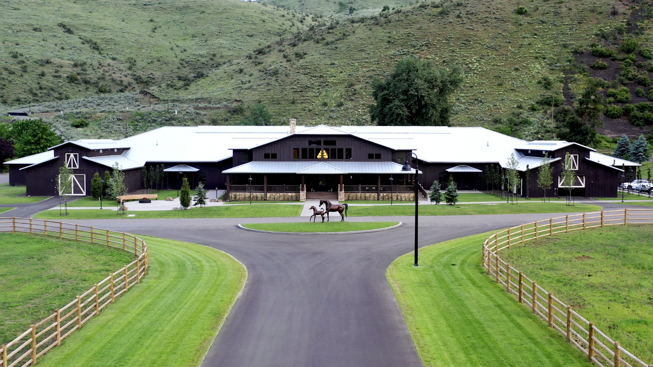
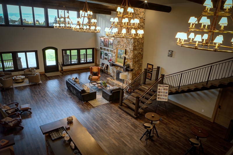
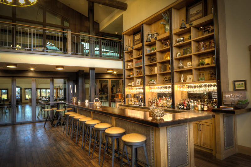
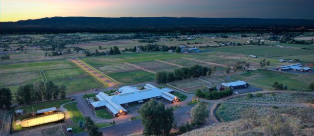
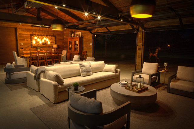
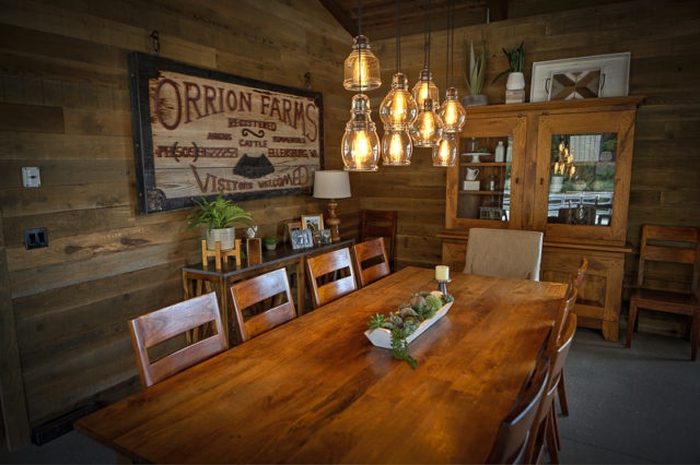
A brand should always zig when the rest of their competitors zag. This isn’t a new idea, but it’s amazing how strong the herd mentality in marketing can be. In this case, we noticed that 100% of the Arabian horse websites we sampled focused on the horses. Which kind of made sense, since they are selling horses. (Like Nike sells shoes, but their marketing is all about the athletes who wear the shoes.) So we looked for a hook that would work to sell more horses while not focusing the marketing on all horses, all the time. Once we were on-site, the answer became clear: The farm itself. Gorgeous grounds, incredible amenities, impeccable attention to detail. We watched them (literally) wine and dine the horse breeders who had come to visit them. It’s like the Ritz Carlton or Four Seasons of horse farms. So that became our strategy — be the Ritz of the ranches.
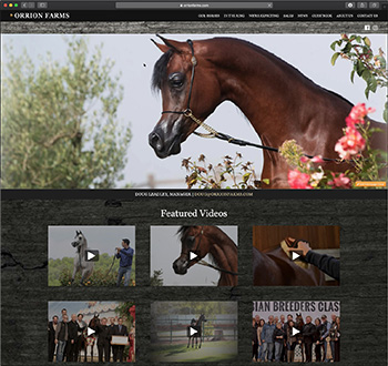
Home Page Before lofgren
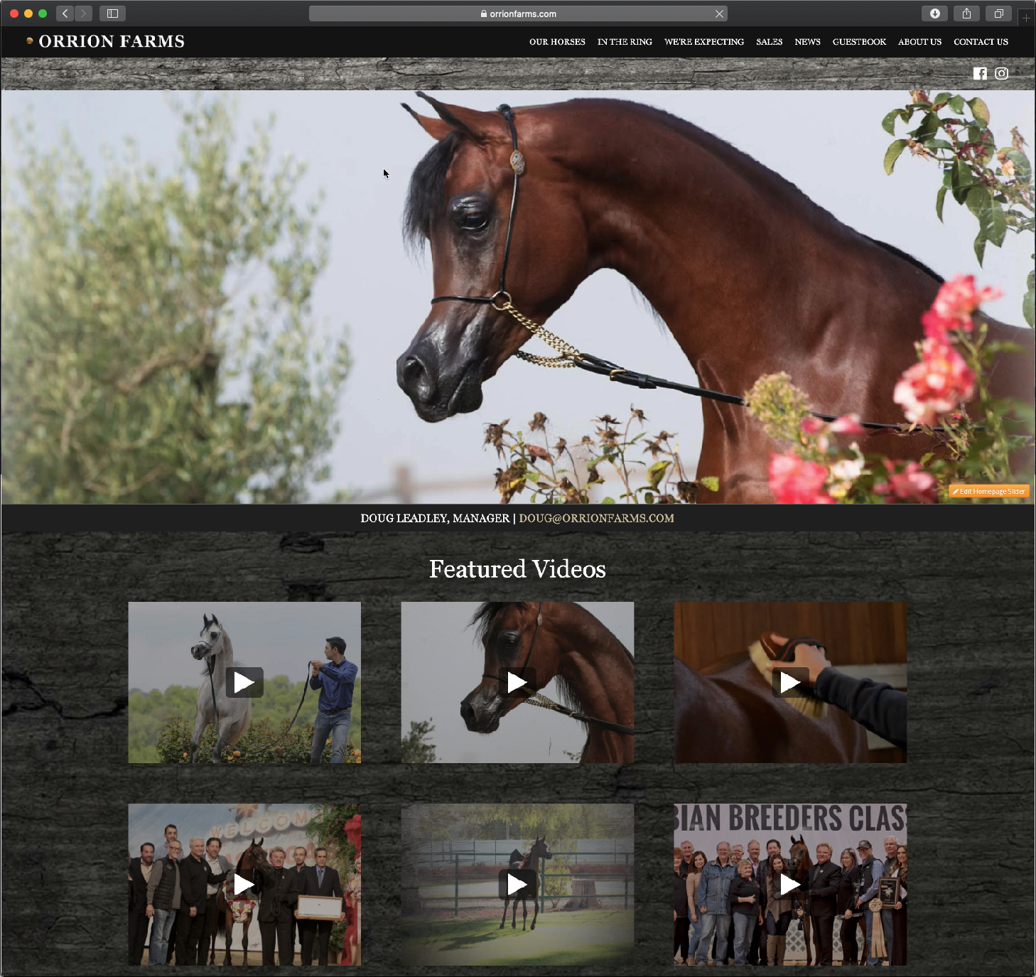
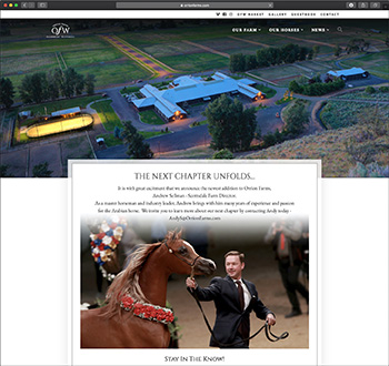
Home Page After lofgren
Brand Definition
While it may seem obvious that we would begin with the website, we did not. Because a website is a tactic, not a strategy. And we needed a foundational strategy upon which to build this brand. That began with creating a four-point Brand Definition that included a Brand Vision, Brand Position, Brand Personality, and Brand Affiliation (the personality of our core customers). Why bother? Well, ask three people in a company to define their business and brand and you’ll get three different answers. Even — sometimes especially — if those three people are the CEO, COO, and CMO. If you really want to move the brand onward and upward, people need to be in agreement as to what “the brand” really is. And once it is defined, the creative team has a bullseye at which to aim. So, after several interviews, workshops, and exercises, we arrived at our desired outcome. Which we can’t share with you for reasons spelled N-D-A. But if you visit the new website and think, “Orrion Farms sure does seem elegant, trustworthy, experienced, giving, and friendly,” you may have sussed out their Brand Personality.
Photo & Video Assets
Before diving in with redesigning the website and other marketing materials, we needed to create a visual aesthetic for Orrion Farms that would flow through all the pieces. It just so happens that Kevin is also a professional still photographer and video director/editor.
Photography
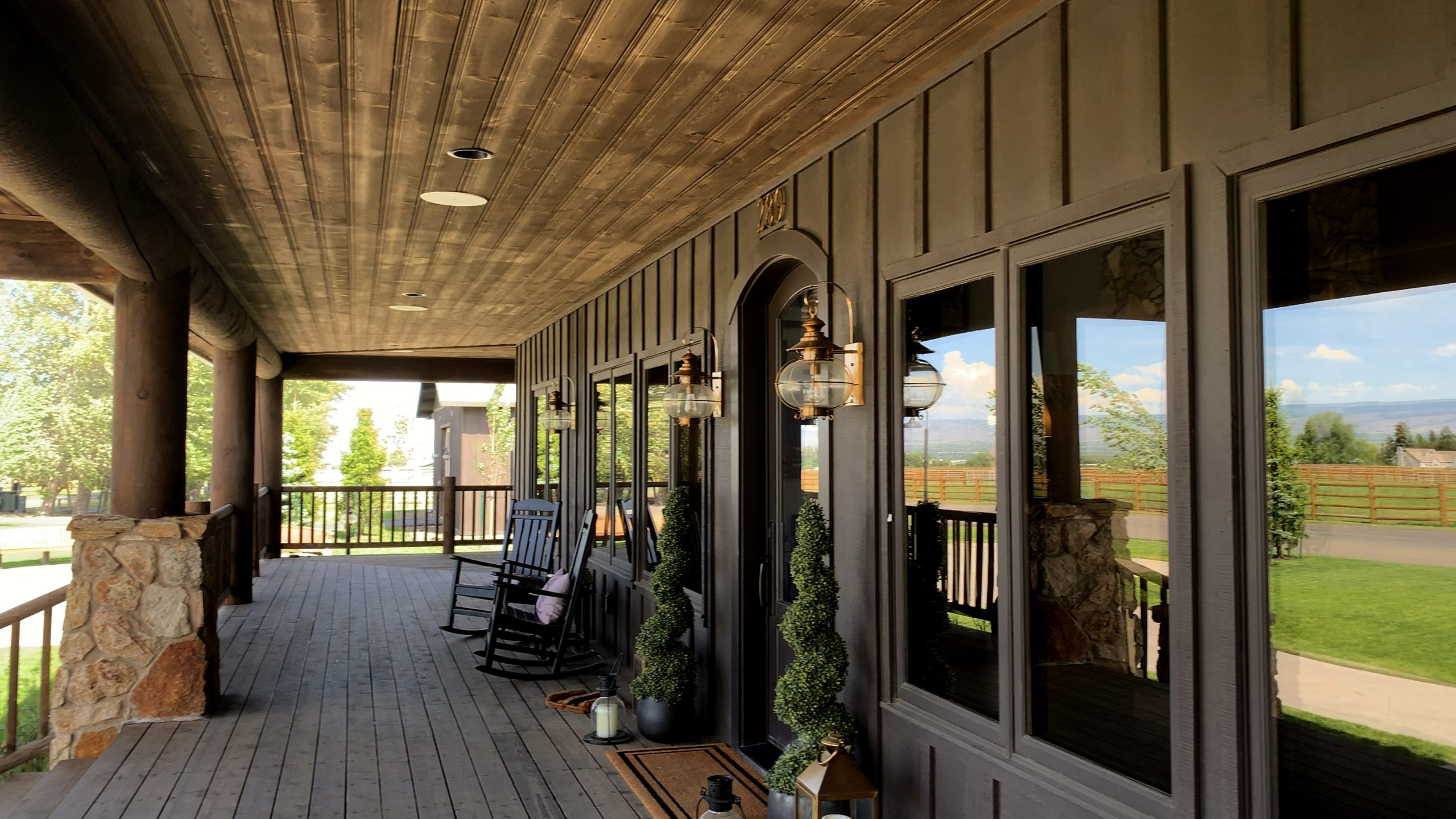
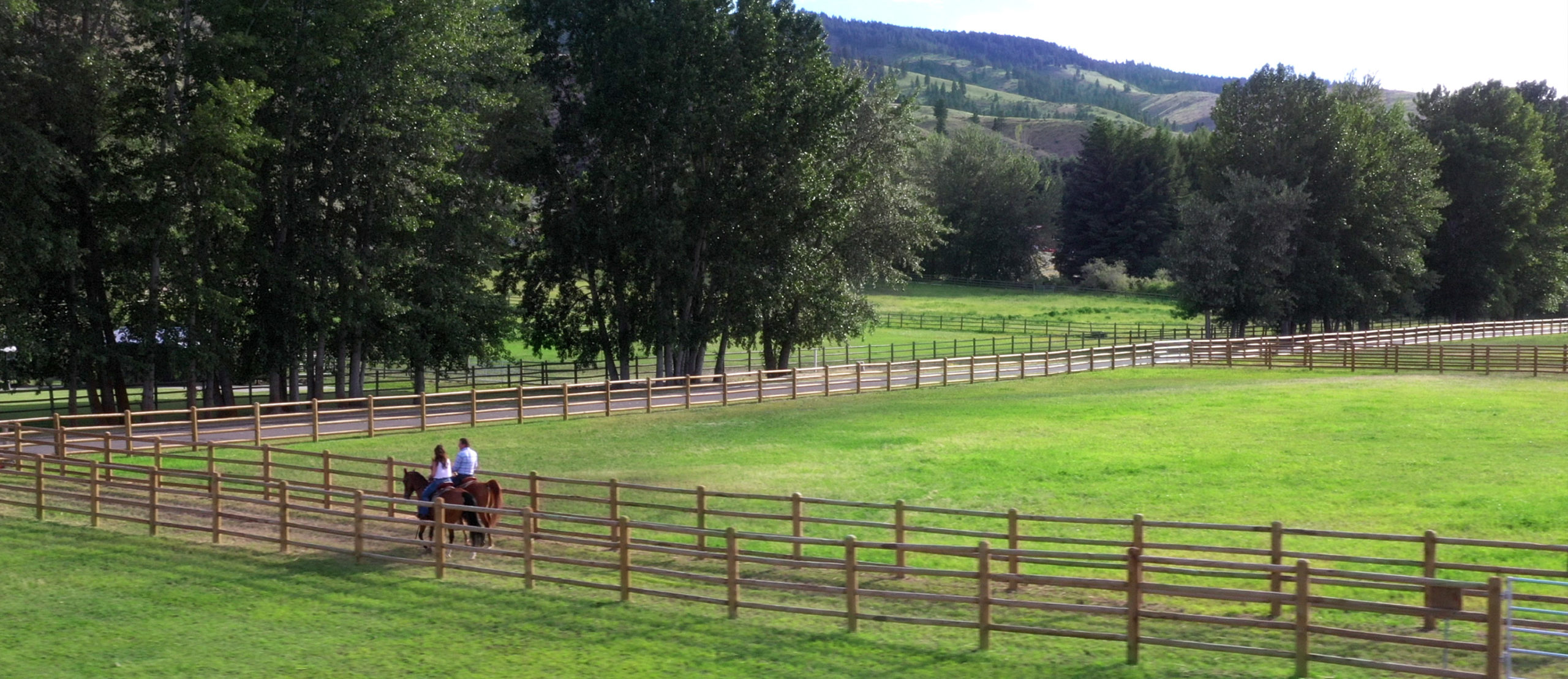
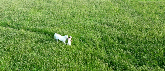
The goal with the photography was to capture images that were worthy of framing. In good frames, not the $6.99 kind from Walmart. Even the shots of the groomers tending to the horses were composed to elevate the experience of being on-site and entice people from across the country or around the globe to visit.
Animated Logo
Anytime we create videos for our clients, we want some sort of bookend on either side. An opening and ending that makes the video feel like a complete production. In this case, we originally used the same animation for the opening and closing of the video. However, when editing the video, Kevin had the idea of changing the outro up ever so slightly. He added a sound effect of a herd of horses galloping away in the distance. You can watch/listen to it below.
Note: these will look exactly the same. You’ll need your sound on to hear the difference between the two.
Intro:
Outro:
Video
Not only did Kevin handle the photography duties himself, lofgren acted as the production company for the primary video piece, titled “Welcome to the Farm.” From directing drone operators to editing to music creation to final assembly, every aspect was overseen or authored by Kevin. You can read the full case study focusing on that video here.
Or, if you don’t care how the proverbial sausage gets made, you can just watch it below:
Website
Navigation
The website, frankly, had to be perfect. More than any other piece of communication, the site had to draw people in and inspire them to visit — not just because of the horses, but because of the experience, too. And it needed to be simple in its architecture. Because complicated is the antithesis of classy. To that end, we focused the site’s primary navigation on three main areas: the farm, the horse, and news.
Home Page: Announcements
On the homepage, we felt it was important to have a special announcement section that would be constantly updated with the latest information about upcoming shows and the horses they’d have there. So we decided to have that peek up over the video, giving repeat visitors instant notice that something had changed since the last time they came. The client can easily update this section without our assistance because we built the site in WordPress instead of nefariously locking them into yet another proprietary platform.
Click on the photo below to see the full home page.

Home Page: Background Video
In keeping with the theme of creating a “Ritz” type of experience, we decided to add several clips from the video we collected while on the farm to the header’s background. It was certainly going to be more impressive than the typical stock photo in its place.
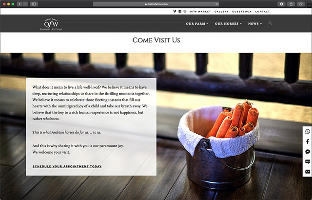
From the homepage, we led people to the farm. Strategically, we wanted people to be in awe of the farmstead before they even started browsing the horses. The video impresses them, our story endears them, and our people welcome them. Even if you didn’t want a horse, you would want to spend a month of days here.
Arabian Horse Shopping
Naturally, the reason most people come to the site is to view the steeds on offer at the farm. The typical way of showcasing horses online has historically been to, well, list them. Possibly with a thumbnail photo. But the parsing was left to the visitor, which is very bad UI (that results in even worse UX). The Orrion Farms “Our Horses” page acts more like a high-end boutique storefront. Visitors can narrow their selections by gender, discipline, cost, and color. Users can even select to only see currently expecting mares. Is it unique in the world? No. Is it unique in the world of horse breeding? Yes. And that makes it a strategic, competitive advantage.
Important Touches
We sprinkled a few unexpected-yet-important bits throughout the website. First, you’ll notice that at the bottom of most pages there is a gallery populated with photos from Orrion Farms’ Instagram account. Instagram is perhaps the most popular form of social media advertising within breeding circles, so it was important that these photos be featured. However, we went a step further and made it possible for visitors to view captions, comments and likes without ever having to leave OrrionFarms.com.
Emphasizing the Differences
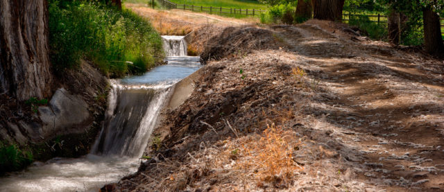
We also wanted to highlight that Orrion Farms is good steward of all things natural — from the horse, to the land, to the water, and feed required for their upkeep. Smart irrigation pumps that conserve energy. A watering schedule that helps keep the entire valley sustainable. A paddock design that promotes both safety and access for horses and humans alike.
Here’s the “Our Philosophy” Page:
This page features photographs by Kevin, which we dig. But more importantly, this page tells the behind-the-scenes story of the farm. A story that had not been told prior to our involvement.
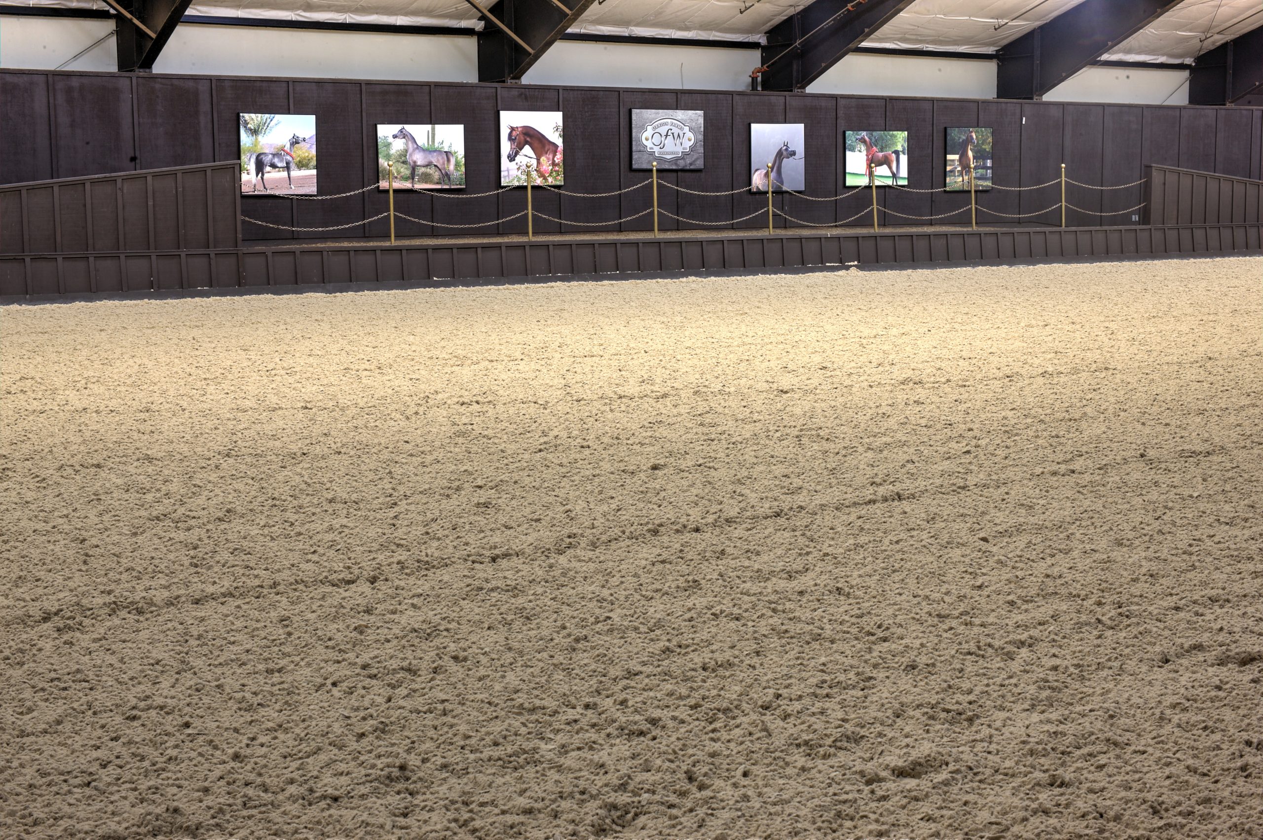
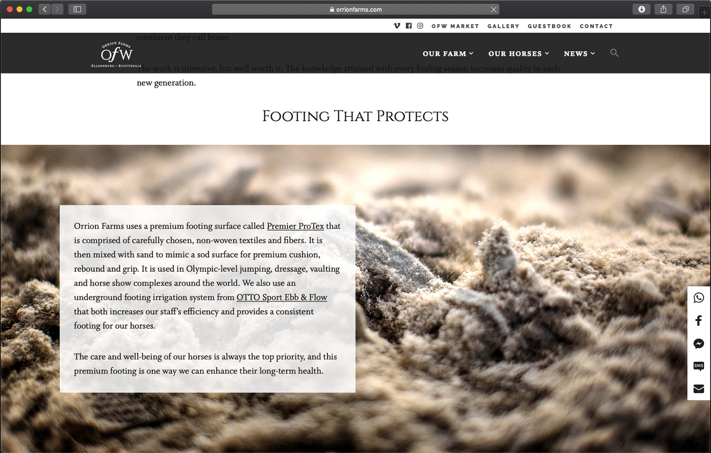
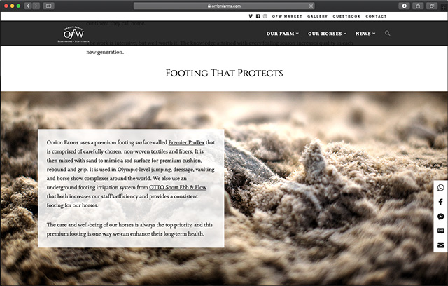
For example, Orrion Farms leverages a special ground cover in the show ring, called “footing,” that minimizes injuries to the horse. Maybe that seems a bit extravagant, but it actually saves the farm money by not losing horses to injury, so the balance sheet ultimately works.
But when someone sees a photo of the pavilion, they likely have no idea what exactly is so special about the footing. See? Looks pretty normal, right?
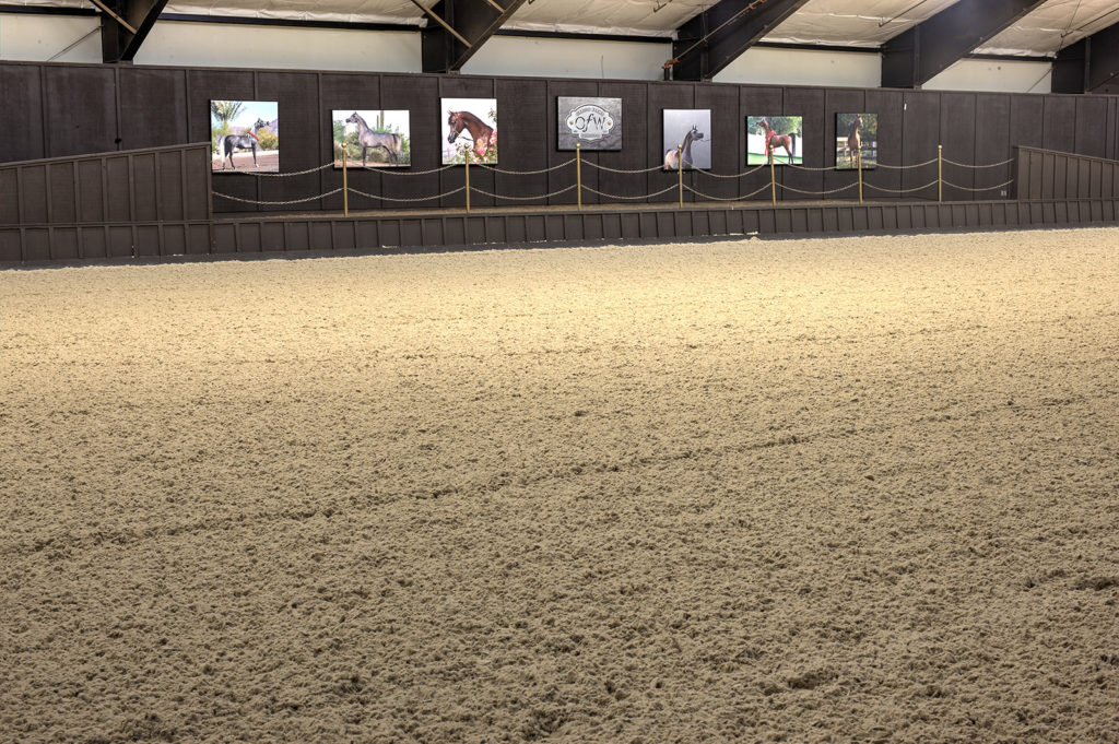
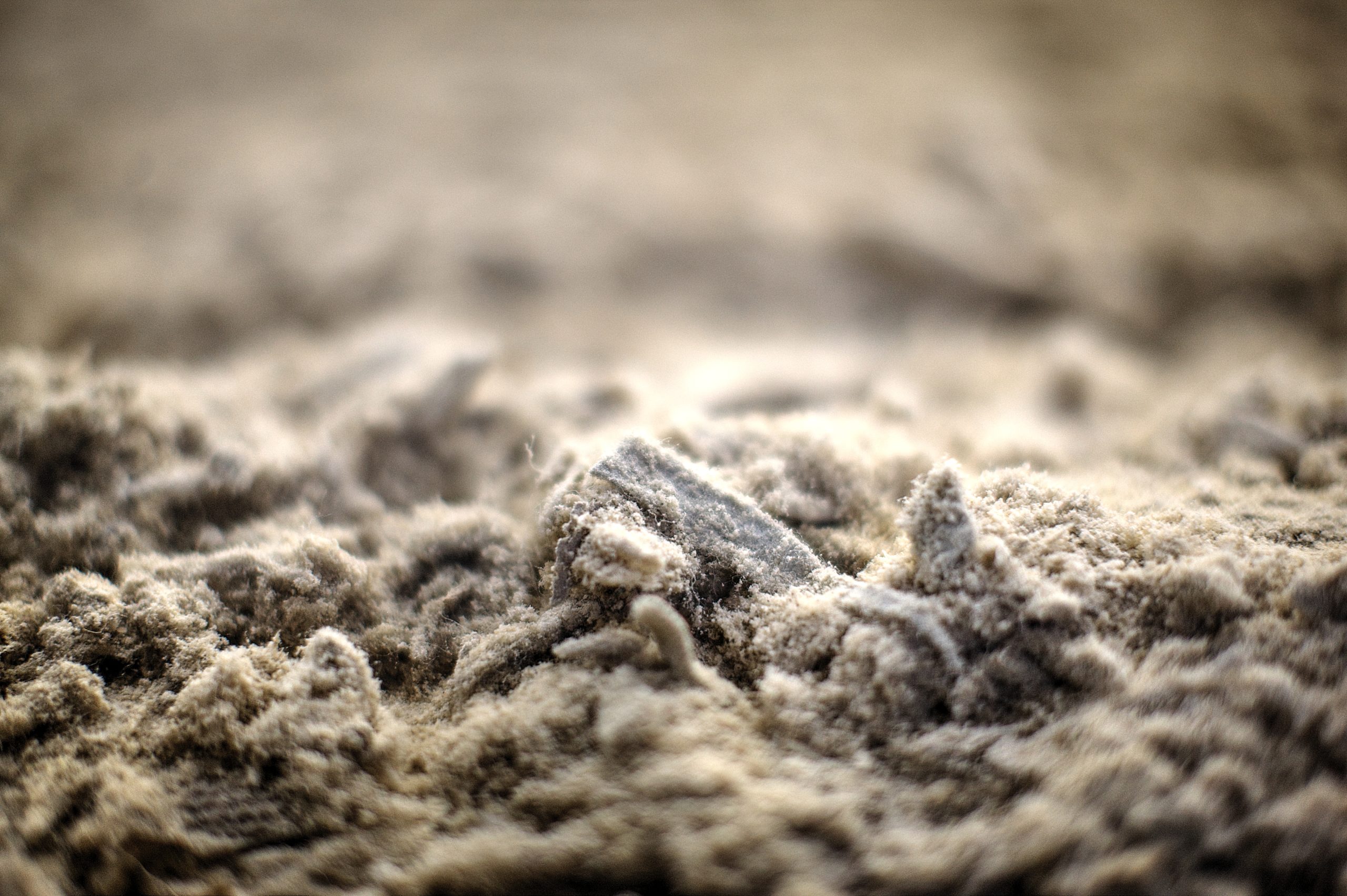
So, Kevin got on his belly, threw the ol’ macro lens on the camera and shot what was really going on underneath the surface. Then we used that shot to explain why it mattered (see below).
This is what we do. We focus on the details that may not be the first thing people think about, then we encourage them to think about them.
Outcome
With a strategic platform, new website, and additional creative assets ready to roll, Orrion Farms has already begun burnishing their reputation with existing devotees and drawing new admirers — and buyers — into the fold. Their brand expressions — or “marketing materials” in old-school speak — set them apart from every other breeder (of Arabians or otherwise) on the planet. Which is the point of marketing and branding after all, isn’t it?
