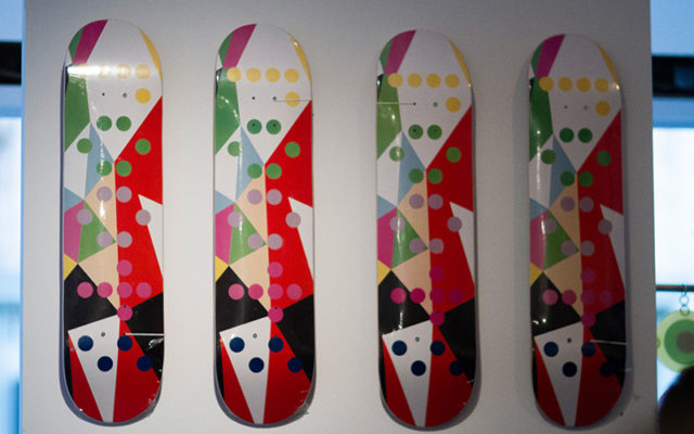
Roots Canada Experiential Site
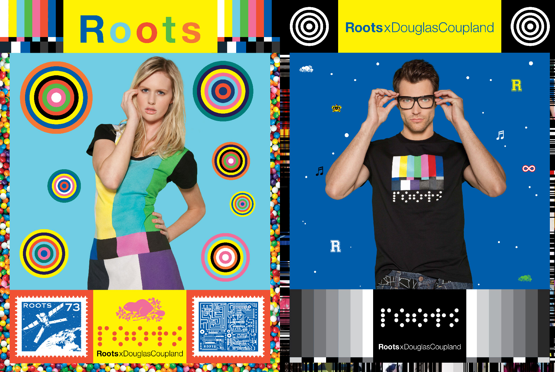
Roots is a leading-edge clothing and lifestyle retailer headquartered in Canada with over 160 stores in North America and Asia. Roots approached us to help create a unique online showcase for their collaboration with famed “Generation X” author Douglas Coupland.
Situation
Roots is a leading-edge clothing and lifestyle retailer headquartered in Canada. Named one of “Canada’s most iconic brands” by Canadian Business Magazine, Roots operates over 120 stores in the U.S. and Canada, along with more than 40 stores in Asia. Roots approached Lofgren with a very interesting project. They were creating a clothing line in collaboration with novelist and visual artist Douglas Coupland – the man who coined and popularized the term “Generation X” – and they needed a website that was “beyond the norm” to showcase it.
Website
Roots wanted to engage people in an unconventional digital space that closely aligned with Coupland’s concept of “Canada goes electric.” We accomplished this by using unexpected visuals, unorthodox navigation and unmoderated (yowza!) social interaction. The site was, hyperbole aside, groundbreaking for the time. Its navigation felt endless, flowing from one section (which feels like a weak description, to be honest) to the next without the strict hierarchical menu system to which we are all so accustomed. All accompanied by a soundtrack that evoked Coupland’s unique aesthetic.
Here’s what visitors saw when the site first loaded:
In short, the site wasn’t “user friendly” in the traditional sense. Far from it, in fact. It violated just about every UI/UX principle Kevin had ever held sacred (Kevin got his start in 1997 as a user interface designer, so there are quite a few of those). But that was the point. To create the ultimate example of surprise-and-delight.
The navigation was constructed in such a way as to guide the user on a surreal journey through Coupland’s mind — at times hopeful or melancholy or thoughtful or joyous. Again, with eclectic music that enhanced the mood. Of course, users had to find the navigation first as it was tucked away in the lower right-hand corner. An atypical place for an atypical experience.
You can see how the navigation worked here:
The site featured unique transitions from product-to-product and page-to-page. As the user rolled over products, a pop-out frame would highlight selected items and reveal a bit of information (not unlike a “quick view,” but more stylish). Page-to-page navigation behaved similarly with a large scrollbar that popped out from the left edge of the screen that showed major categories and subcategories.
Some of the transitions are shown in this clip:
The “Shop” button appeared only when the user navigated to a particular area on the page. Clicking the button led to the Douglas Coupland line in the Roots.com main e-commerce store.
This clip shows some of the shopping/browsing interactivity:
We also fed in dynamic content in the form of tweets based solely on keywords (as opposed to asking brand fans to use a specific hashtag). Such Twitter integration was quite rare at the time, which helped further cement the site’s status as cutting edge.
Here are some of the tweets that popped up on the site, proving that the best feedback is feedback freely given. Overall, the response from our audience was enthusiastic. People loved the look and feel of the site.
 |
 |
 |
 |
 |
 |
 |
 |
 |
 |
 |
 |
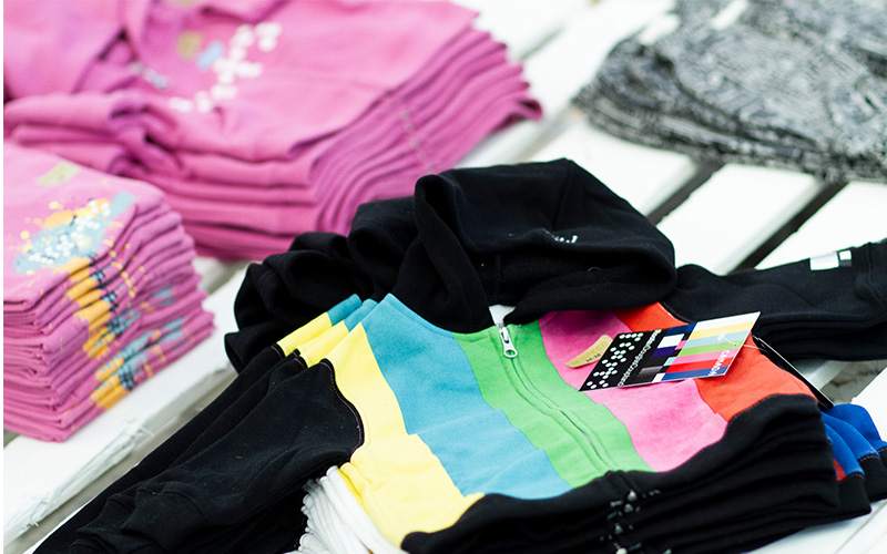
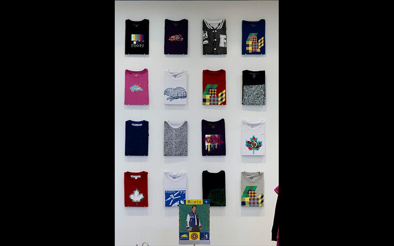
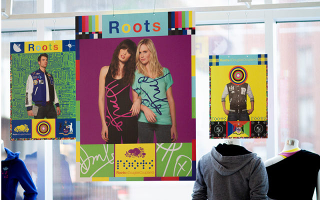
As an extension of the Coupland collaboration, pop-up stores sold Roots X DouglasCoupland merchandise direct to consumers, along with having kiosks for ordering from the more expansive online inventory. In stores, cashiers handed out postcards with every purchase that directed customers to go to the site. Each piece in the line had a dangler tag with the www.roots.com/douglascoupland address, further directing traffic to the site.
Photos from the store:
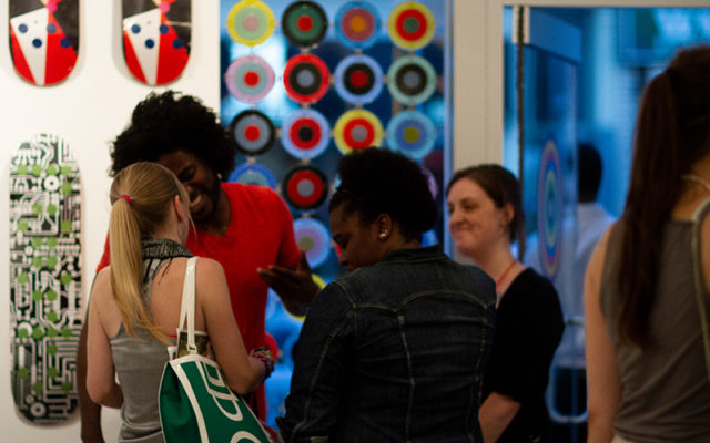
Photos from the launch party:
And this video is a good overview of the entire site’s experience:
Outcome
Email Campaign
Ultimately, this was a collaborative experiment to see if the site would promote the clothing line enough to lead directly to sales. The results were much better than Roots (but not us, to be honest) had hoped for. Instead of our goal of a 4% click-through rate on emails, we produced a 7.13% click-through rate.
Viral Sharing
Our goal was for 12,000 unique visitors to the site, hoping for an average of 3 incremental visitors per email we sent. In actuality, we produced 48,523 unique visitors to the site (an average of 7 incremental visitors per email blast).
Sales
We wanted to see sales coming from the site visitors at least 600% in excess of the amount invested in the site itself, and we definitely exceeded this by a mile. Unfortunately, the client is not willing to publicly release this information but suffice it to say they were very pleased.


